
Visualizing Earthquakes

I’ve been thinking it would be interesting to visualize all the earthquakes which have occurred in the recent past. I started, of course, by looking for some data. Fortunately, the US Geological Survey provides comprehensive data on recent earthquakes. Unfortunately, they did not have a lot of historical information—providing 30 days, at most. So, over the past few months, I’ve been collecting the data in 30 day increments. I now have about five months of data, going back to August 16.
Earthquake Frequency
When I began to review the data set, I was shocked by the sheer number of earthquakes. I was surprised to learn that hundreds of earthquakes occur every single day. In September alone, for example, the US Geological Survey recorded 8,948 earthquakes!! Most of them were very small, falling well below the magnitude which can be felt by people (around 3.0). Alternatively, there were very few large earthquakes (greater than 6.0). This, I discovered, is how earthquakes generally work. There are lots of them at smaller magnitudes and they happen almost constantly, but larger ones occur much more rarely. The following graphic from the US Geological Survey demonstrates this quite nicely, while also showing the energy release and destructive power at each level of the scale.

Scale
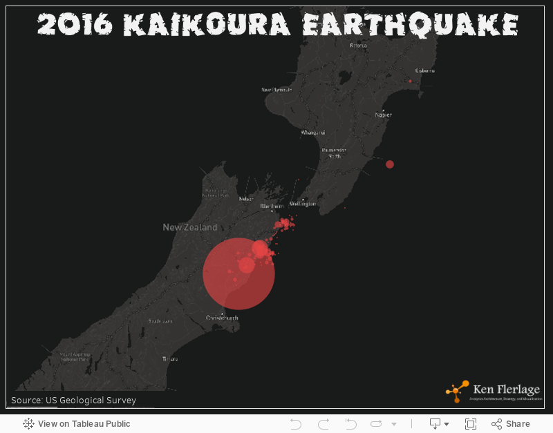
With the data in hand and a better understanding of earthquakes overall, I began to visualize the data in Tableau. I started by using circles and sizing them according to the magnitude, but I quickly ran into a problem. As an example, I’ll use the Kaikoura Earthquake which occurred in November in New Zealand. Sized using magnitude, the visualization looks like this.
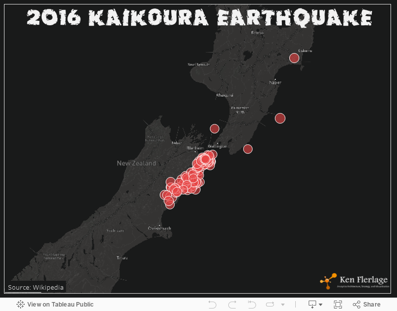
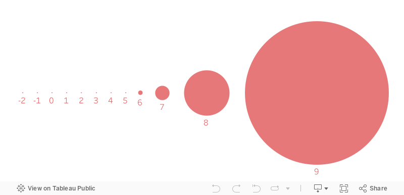
This gives a good indication of the number of earthquakes, but it’s almost impossible to differentiate the sizes of the earthquakes. The problem here is that the Richter Scale is not linear—it’s logarithmic, which means that an increase of 1 on the scale increases the strength of the earthquake by 10. A magnitude 2 quake is 10 times the strength of a 1 and a 3 is 10 times the strength of a 2. The primary quake in New Zealand, which is almost impossible to see above due to its existence within a large cluster of quakes, was a 7.8. This earthquake was 631 times as powerful as the 5.0 earthquake which occurred near Gisborne on November 26 (shown above in the upper right). The following gives you a picture the differences in each of the magnitudes.
So, I switched to use a relative magnitude and here’s the updated visualization.
This, of course, gives a much better picture of the relative power of each earthquake, while still giving you an idea of the sheer number of earthquakes overall.
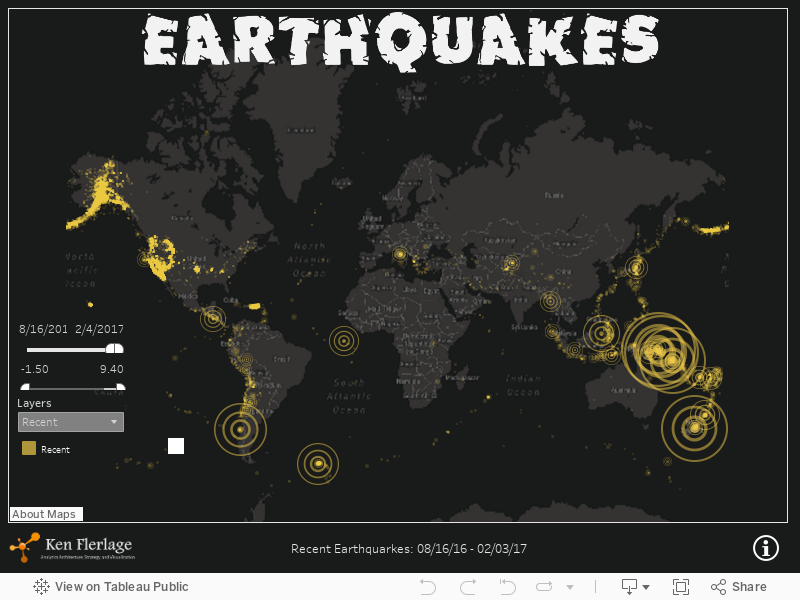
With my scale corrected, I proceeded to complete the full visualization. Here’s the result:
While I think this is quite nice, I immediately started asking more questions. How does the largest of these earthquakes compare to the largest of all time? What areas of the world experience the most and largest earthquakes? What information is available on historical earthquakes? So, I decided to add additional “layers” to the visualization to help answer these questions (the data for all of these were obtained from Wikipedia). The visualization now has the following layers:
- Recent – The recent earthquakes in the original visualization. (Wikipedia)
- Largest – Largest recorded earthquakes. (Wikipedia)
- Largest by Country – Largest earthquakes experienced by each country (Note: Not all countries are included).
- Pre-1900 Historical – Known earthquakes prior to 1900.
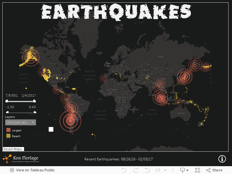
You can view any combination of the different layers together in order to compare and contrast. For example, here’s a comparison of recent earthquakes to the largest of all time.
Note how small the New Zealand earthquake looks in comparison to the largest of all time, a magnitude 9.5 quake which occurred on May 22, 1960 near Valdivia, Chile. This earthquake was 50 times as powerful as the New Zealand quake and was equivalent to 1,000 atomic bombs.
That’s all for now, but please take a look at the visualization and explore further (you can find it here). As usual, I had to scale the viz down quite a bit to fit nicely into this blog, so viewing on a desktop will give you a much better experience.
If you find any additional insights or have any thoughts or questions, please let me know in the comments section.
Sources:
Pre-1900 - https://en.wikipedia.org/wiki/List_of_historical_earthquakes(11th-18th century only)
Largest Overall and Largest by Country - https://en.wikipedia.org/wiki/Lists_of_earthquakes
Ken Flerlage, February 6, 2017


No comments: