
Tableau Beyond “Show Me” Part 1: It’s All About the X & Y

This is part 1 of a 3 part series on going beyond the charts available in the “Show Me” panel in Tableau. In this first post, I’ll dig into my first “aha” moment which totally changed how I viewed Tableau. In the next, I’ll take these concepts to the next level by introducing some of the math needed to create more advanced custom visuals.
Who’s this For?
If you’re already an advanced Tableau user, then this post is not for you (though I’d love for you to stick around and give it a read). Rather, this first post is for those of you who are where I was this time last year. You’re a Tableau user and know the product fairly well. You may have been using it for just a couple of months or even years. But you tend to only create charts available in the “Show Me” panel. Now don’t get me wrong—there is a reason why Tableau has chosen to include these 24 default chart types. Ultimately, these will be your best choices for any given project. In my opinion, you can meet almost any need with simple bar and line charts. But, it is possible to step outside of what’s available out of the box and create your own completely custom visuals. And the first key to that is coordinates, which I’ll discuss in this post.
It’s Just Coordinates
Let's go back approximately one year. I’ve written and spoken about my Tableau “aha” moment before. This is when I realized that Tableau is more than just a tool that can create charts, but instead it’s a platform that allows you to create anything in the world you can imagine. At the time, I had been using Tableau for a few months and thought it was a good platform. It did so much of the heavy lifting and made it incredibly easy to create handsome and insightful visualizations. But, I was using the default chart types exclusively and wanted to do more. Unfortunately, I started to feel that Tableau was too limiting and that the only way I’d be able to create what I wanted was to code it by hand. Thus, I started down the path of learning D3 so that I could create my own completely customized visuals. As I was getting started with it, I had the idea to create an interactive periodic table, but I hadn’t yet learned enough to create it in D3. But Tableau didn’t seem like an option either because I just couldn’t see how I could create a periodic table out of any of the default chart types. I thought about this problem for a while with no luck. And, unfortunately, I had not yet discovered the Tableau Community, so I was kind of on my own.
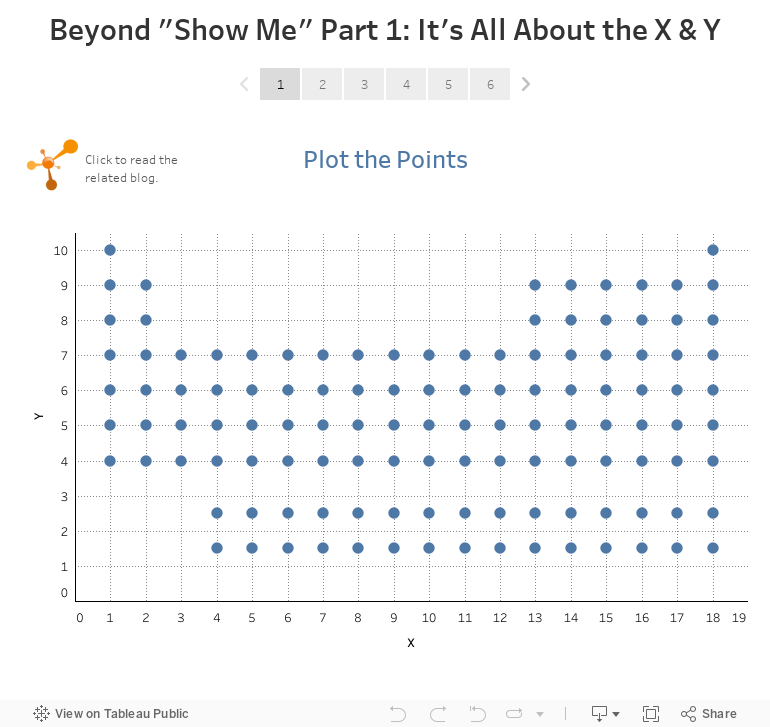
Then, one day, it hit me—my “aha” moment! I realized that the periodic table was nothing more than x,y coordinates plotted on a cartesian plane. Now even if you’re not a math wiz, you remember plotting points on x and y axes and then connecting them to create lines or curves, as shown below.

The Periodic Table
So, is a periodic table really any different? No, it’s not—the periodic table is laid out in a grid pattern, just like a cartesian plane and each element is essentially a point. So, I sat down with a physical copy of a periodic table and drew a grid around it. I then recorded the x and y coordinates for each of the elements, documenting them in an Excel spreadsheet. Finally, in Tableau, I plotted the points on a scatterplot, as shown below:
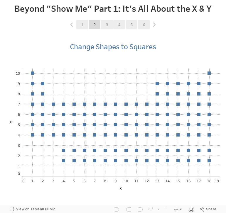
Next, I changed the shapes from the default circles to squares.
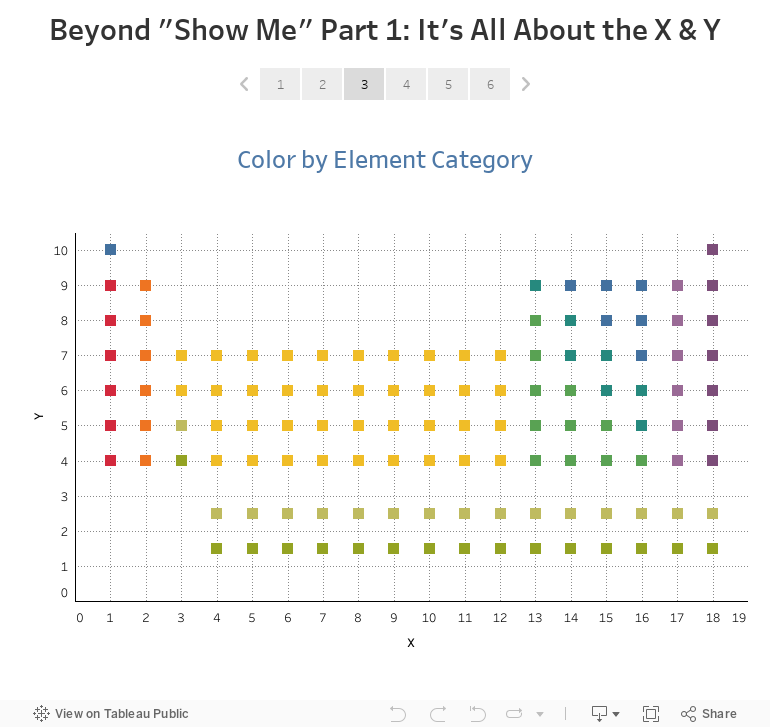
Then, I colored each shape based on the element category.
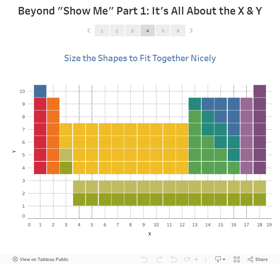
I then increased the size of the shapes so that they all fit together in a nice grid layout.
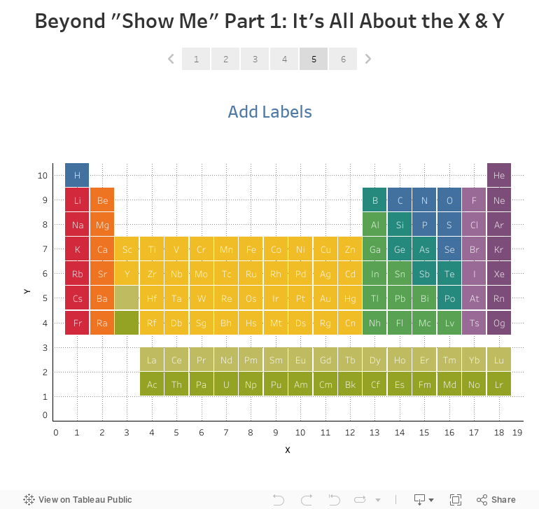
Text was added to each element.
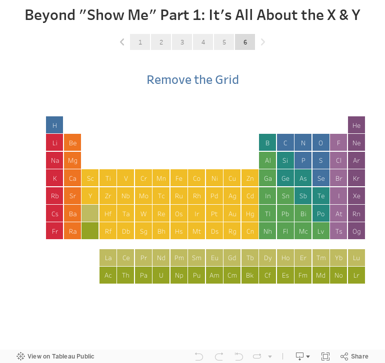
And, finally, I removed the grid.
Now, if you already know this stuff, then the above seems very obvious to you (it does to me one year later), but at the time, it was a revelation! Once I realized that I could use a scatterplot to plot points on a cartesian plane, then it seemed I’d be able to do anything.
But it’s not only plotting points—you can also draw lines (or curves) connecting points. And with these capabilities, the only limit to what you can create is your own imagination. When all is said and done, plotting points on a plane then connecting them is the very basis of every single custom chart type you’ll run into whether it’s a sankey or a chord or a jump plot—they all start with getting those x and y coordinates.
My Next Post
In my next post, I’ll build upon the concept introduced here and discuss how we can use mathematics—mostly trigonometry and geometry—to take our point plotting and line drawing to the next level. (See the next in the series: Beyond "Show Me" Part 2: Trigonometry).
Ken Flerlage, November 10, 2017


Can you help share me the excel workbook used for this visualization....
ReplyDeleteSure, you can find it here: https://www.amazon.com/clouddrive/share/HBDqorLbzmif3sfR3tPfLV3UAj7jRxCpSCkriVbmzlO
DeleteNote: The original data set came from Penn State University.
Hola buen día, descargue le versión gratuita pero observo que no tengo habilitado la opción superior derecha de "Mostrarme" no tengo habilitadas las graficas que debo modificar?, agradecería sus comentarios por favor.
ReplyDelete¿Habla usted Inglés?
Delete