
Visualizing Hierarchies (Using Religion Data)

I’ve been writing a lot about politics lately, so I think I’ll write about something a little less contentious—religion. Kidding aside, I recently came across a really interesting infographic, from a few years back, on the National Post showing the world’s major religious traditions and how those break down into smaller subgroups. Check out the infographic below.

I found the infographic incredibly intriguing, both because I have always been interested in the world’s different religious faiths, but also, of course, because I love data. From a data visualization standpoint, I feel that this graphic does a tremendous job of showing the hierarchical nature of the religion data and the relative magnitudes of each level of the hierarchy.
This got me thinking about different ways to visualize hierarchical information. So, I’m going to talk about 6 different methods I’ve worked with. I’ll use the religion data set used in the infographic discussed above.
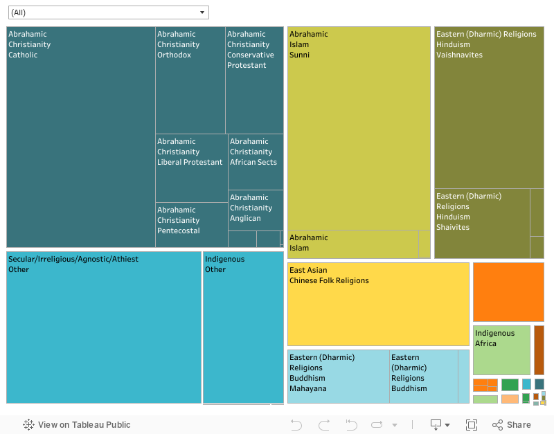
1. Treemap
The most basic and most common way to visualize hierarchical data is through use of a treemap. A standard treemap typically uses a rectangular layout. The first level of the hierarchy are shown in rectangles, the size determined by some measure (in my case, the number of adherents to the given religious tradition). Then, each rectangle is further sub-divided into smaller rectangles for the next level of the hierarchy and so on. Color is typically used to highlight one of the hierarchical levels. Due to its rectangular nature, treemaps are able to remain very compact and use the space on screen to its fullest. Theoretically, there is no limit to the number of hierarchical levels that can be visualized with a treemap, but in practice, the data becomes very difficult to see the more levels that you add. Here’s a treemap of the religion data, which I created in Tableau.
2. Sunburst
A sunburst is really just a treemap which uses a radial layout (thus the alternative name, “Radial Treemap”). Sunbursts are a series of rings, which represent the different hierarchical levels. The innermost ring is the first level, followed by the second level which shows a breakdown of the components of the first, and so on. Like the rectangular treemap, the size of the arc represents the magnitude of a metric and color is often used to distinguish some level of the hierarchy. Here’s a sunburst I created in Tableau using a method developed by Bora Beran, which is documented here: https://boraberan.wordpress.com/2014/12/31/radial-treemaps-bar-charts-in-tableau/
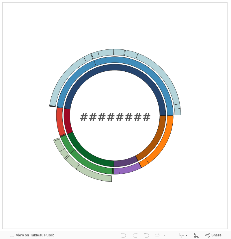
I’ve never been a big fan of doing charts in Excel, as I’ve always felt a true visualization tool can do a much better job, but I was really intrigued to see that Excel 2016 now offers some more advanced charts, including a sunburst. I was able to very quickly put together the sunburst below (in much less time and with much greater visual appeal than the Tableau chart). Excel can also do rectangular treemaps.


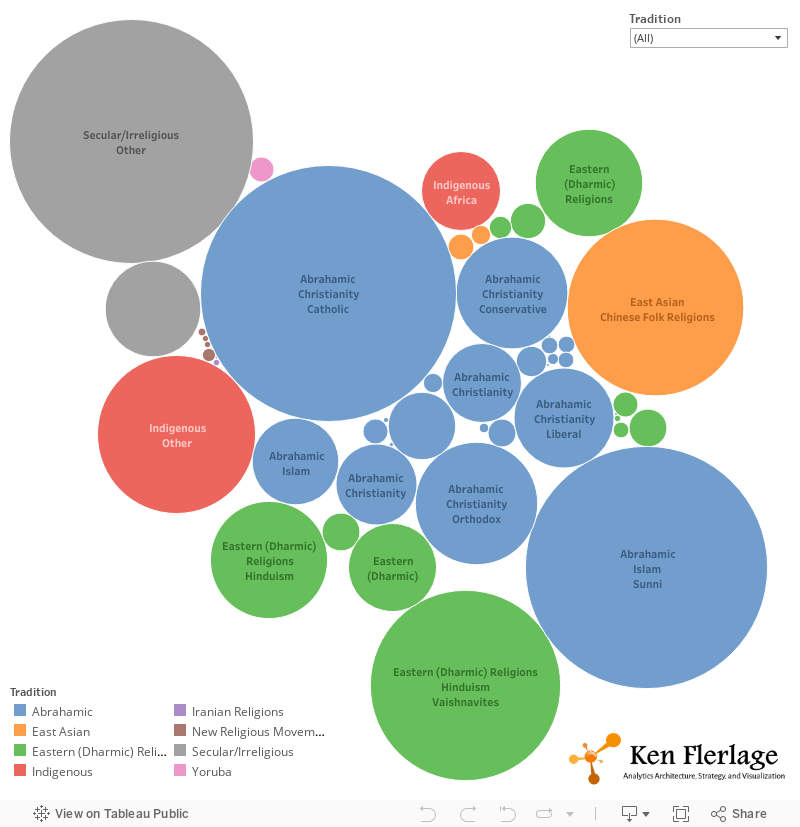
3. Packed Bubbles
I hesitated on whether or not to include packed bubbles here, as I feel it does not truly represent the hierarchies we’re trying to display. This type of visualization essentially shows the lowest level of the hierarchical data (not necessarily the last level, but the last level available for a specific record). Though you can use color to identify one of the parent categories, It fails to accurately represent the size of any of those parent categories. It also fails to demonstrate the hierarchical relationship between different levels. Below is a sample created in Tableau.
4. Circle Packing
Circle packing is another type of treemap (also known as a “Circular Treemap”). This type of visualization is similar to packed bubbles, but it addresses the inability to see the relationships between the hierarchical levels, as well as the problem of showing the magnitude of parent levels. Unfortunately, circle packing charts suffer from other problems. The use of circles means that there is a lot of wasted space. And, as shown in the example below, the labels can be quite difficult to read, particularly as the number of levels increase. Below is a circle packing chart I created with RAW (http://raw.densitydesign.org).
5. Dendrogram
Dendrograms are entirely different than the visualization shown above. Dendrograms are essentially tree diagrams that show the hierarchical relationship of a data set. The most straightforward style is a cluster dendrogram, which shows the data horizontally, as shown in the following chart I created using RAW.
Another style is the radial or circular dendrogram, where the data is represented in a circular pattern.
Dendrograms are better than treemaps at showing the hierarchical nature of the data, but they do not show the magnitude of any single item on the chart (this is simply not what they are designed for). There is no way to tell from the charts above, for example, that Mandeans are a tiny religious group, as compared to Christians.
6. Foamtree
Foamtree is not exactly a different type of visualization, but rather a product with a very interesting implementation of treemaps. Foamtree, which was created by a Polish company called Carrot Search, implements a Voronoi treemap, which uses polygons instead of rectangles or circles. Like rectangles, polygons make much better use of the space available on screen. But, the beauty of this implementation is how it mitigates the problem of visibility when there are numerous levels to the hierarchy. As an interactive tool, it allows you to drill down on a level of the hierarchy and zoom into the component parts within the next level. You can continue doing this, going as deep as you like, with almost no limitations to the number of levels. Below is a foamtree I created with the religion data.


If you double-click on “Eastern (Dharmic) Religions, it will zoom into the next level.

You can then keep drilling. In this case, I double-clicked on Buddhism.

Foamtree has lots of different options for the visual layout, including a more standard rectangular treemap, as shown below.


This video shows some brief interaction with the religion foamtree and will give you a much better feel for how it works.
Foamtree is a really beautiful tool and I highly recommend that you check it out. You can find it here: https://carrotsearch.com/foamtree
Snowflake?
Most of the visualizations above are “inward”—showing increasingly smaller subdivisions of the whole in an inwardfashion. But, they can be very difficult to view because we’re packing increasingly smaller sets of data (and associated labels) into increasingly smaller spaces. As the number of hierarchical levels increases, this becomes very problematic. Of course, tools like foamtree help to mitigate this problem by allowing you to zoom into each level. But I wonder if there is another method that might work better. What if we could create something like the “World of Religion” infographic, where we start in the middle and grow outward in sort of a snowflake pattern? This type of visualization would certainly help to reduce the problem noted above (though I wonder if we’d have the opposite problem where we simply start to run out of space horizontally and vertically). I have personally not yet seen anyone create a visualization like this, but if you know of a way to create it, I’d love to hear about it.
Wrap Up
Why would you choose one of these visualizations over another? There are, of course, lots of different drivers—level of complexity your audience can handle, visual appeal vs. utility, the number of levels in your hierarchy, developer preference, size of the target device, etc.
So, what’s your favorite method for visualizing hierarchical data? Did I miss anything? Please drop me a note in the comments and let me know what you think.
Ken Flerlage, August 12, 2016


Hey guys! The article is awesome! I agree bubbles don't cut it. Rectangle/area is good for 1 level hierarchies, IMHO.
ReplyDeleteI know it's not your duty to help folks find viz software, but I would really appreciate your help as I'm quite lost. Do you know of any viz software that can produce a visualization of hierarchies for 2+ levels like the following viz, based on spreadsheet data?
Like this viz: https://indiyoung.com/wp-content/uploads/2020/03/dog_mm_diagram_v24.pdf.
https://indiyoung.com/wp-content/uploads/2020/03/dog_mm_diagram_v24.xlsx
Thanks a lot!
This blog is pretty old and, admittedly, a lot has changed since then. I do pretty much all of my data visualization work using Tableau because I've found that it has more flexibility than most other tools I've used. Happy to help further, but may be more than what we can address via these comments. Feel free to email me at flerlagekr@gmail.com
Delete