
The Home Runs of 2016

Over the past few of weeks, all of the news (and all of my posts) have been focused on the election and the surprise victory of Donald Trump. But we forget that the World Series ended less than three weeks ago with a similar surprise victory by the Chicago Cubs. The series ended just as any baseball fan would like—a one run victory in extra innings of game 7.
Overall, there were fifteen home runs in the series, a big number when you consider that there were only eight in 2015, five in 2014, and six in 2013. Four of these fifteen home runs came in game 7 (three from Chicago and one from Cleveland) and played a big role in the game, accounting for a for a significant number of the fifteen total runs scored.
I haven’t followed baseball closely since I was in my twenties, which also happened to be during the steroids era. But, as Neil Greenberg pointed out in his article, Baseball just saw its biggest home run surge since the steroids era. Here’s why (The Washington Post, March 8), baseball saw a significant surge in home runs starting last season. The home run total rose from 4,186 in 2014 (a twenty year low) to 4,909 in 2015, an increase of 723 home runs (17.3%). In the 2016 season, that total rose to 5,663, an increase of 754 (15.4%). I can’t be sure of the reasons behind these increases and I’ll leave that speculation to the experts (Neil Greenberg’s article is a good place to start to better understand this trend). But this did get me thinking about the home runs hit in 2016. Are there certain parks that see more home runs or longer home runs? Are there specific geographic areas? What about the hitters, pitchers, and teams involved in home runs? Who had the most home runs in 2016? Who hit the longest home runs?
So, I set out to analyze this information to see if we could gain a bit of insight on these questions. Luckily, a gentleman named Greg Rybarczyk has created an incredible website, www.hittrackeronline.com, now owned by ESPN, which “combines several of his interests and talents: baseball, physics, statistics and automated spreadsheet design.” The site includes details about every home run hit since the 2006 season, including information about the physics of each home run. Using a variety of measurements—speed off the bat, trajectory, atmospheric data, etc.—he calculates the “true distance” of each home run, giving us a much better idea of how long a home run would travel were it not impeded by walls, seats, fans, or components of the ballpark itself (you can see a more detailed explanation and example here). So, I used the site to collect some data on all the home runs of 2016. I then created a Tableau visualization to analyze the number and distance of home runs by a number of different dimensions.
Analysis
Let’s start with the question of geography. I created the following map, which shows home runs by ball park. The size of each circle indicates the number of home runs, while the color indicates the average “true distance”.
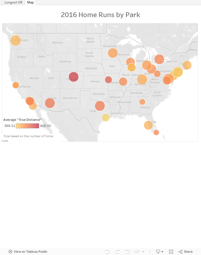
Unfortunately, this geographic view does not tell us much. There does not seem to be any one particular part of the country that produces more home runs than others (other than those areas that simply have more ballparks). But we can see clearly that Colorado results in the longest home runs which, of course, is no surprise to anyone who follows baseball.
So, next we’ll jump right into some simple bar graphs. My Tableau visualization includes a tab which allows you to analyze the number and average distance of home runs by Park, Hitter, Hitter’s Team, Pitcher, Pitcher’s Team, State, and Inning. I don’t want to bore you, so we won’t look at every single view of these, but I do want to show you some of the more interesting ones.
First, let’s take a look at hitters.

The top 5 home run hitters were:
- Mark Trumbo – 48 HRs
- Edwin Encarnacion – 45 HRs
- Nelson Cruz – 43 HRs
- Khris Davis – 42 HRs
- Brian Dozier – 42 HRs
But, interestingly, none of these are on the top 5 list for average “true distance”:
- Carlos Gonzalez – 25 HRs for avg. distance of 425 ft.
- Tyler Flowers – 8 HRs for avg. distance of 423 ft.
- Giancarlo Stanton – 27 HRs for avg. distance of 423 ft. (he also had the two longest home runs of the season, which will be discussed later).
- Trevor Story – 27 HRs for avg. distance of 420 ft.
- Mitch Haniger – 5 HRs for average distance of 420 ft.
Here’s where each of the top five home run hitters ranked on the average distance list:
48. Mark Trumbo – 409 ft.
32. Edwin Encarnacion – 411 ft.
18. Nelson Cruz – 414 ft.
74. Khris Davis – 406 ft.
280. Brian Dozier – 387 ft.
So, interestingly, hitting the longesthome runs does not necessarily translate to hitting a lot of home runs.
Now let’s take a look at the top parks.

The top five parks for total number of home runs were:
- Safeco Field (Seattle Mariners) – 233 HRs
- Yankee Stadium (New York Yankees) – 230 HRs
- Great American Ballpark (Cincinnati Reds) – 228 HRs
- Chase Field (Arizona Diamondbacks) – 221 HRs
- Globe Life Park (Texas Rangers) – 219 HRs
The top five parks for average home run “true distance” were:
- Coors Field (Colorado Rockies) – 420 ft.
- Kauffman Stadium (Kansas City Royals) – 413 ft.
- Chase Field (Arizona Diamondbacks) – 408 ft.
- Globe Life Park (Texas Rangers) – 407 ft.
- Rogers Centre (Toronto Blue Jays) – 404 ft.
Now, let’s look at Inning.

I’m not how much insight can be gleaned here, but it is definitely interesting to see that the fourth inning accounts for both the most home runs and the longest home runs.
Finally, I wanted to look at the longest home runs of 2016. Here are the top 10:
- Giancarlo Stanton – 495 ft., Coors Field, August 6
- Giancarlo Stanton – 490 ft., Marlins Park, May 6
- Mark Reynolds – 486 ft., Coors Field, July 21
- Bryce Harper – 481 ft., Coors Field, August 17
- Carlos Gonzalez – 475 ft., Coors Field, July 10
- Khris Davis – 473 ft., Kauffman Stadium, September 12
- Ryon Healy – 472 ft., Kauffman Stadium, September 15
- Nolan Arenado – 471 ft., Coors Field, April 10
- C.J. Cron – 471 ft., Minute Maid Park, June 21
- Kris Bryant – 471 ft., Coors Field, August 20.
And I just couldn’t resist creating what I hope you agree is a beautiful and engaging visualization (Note: I borrowed the idea for this design from Rody Zakovich’s incredible Boston Red Sox visualization, which you can find here).
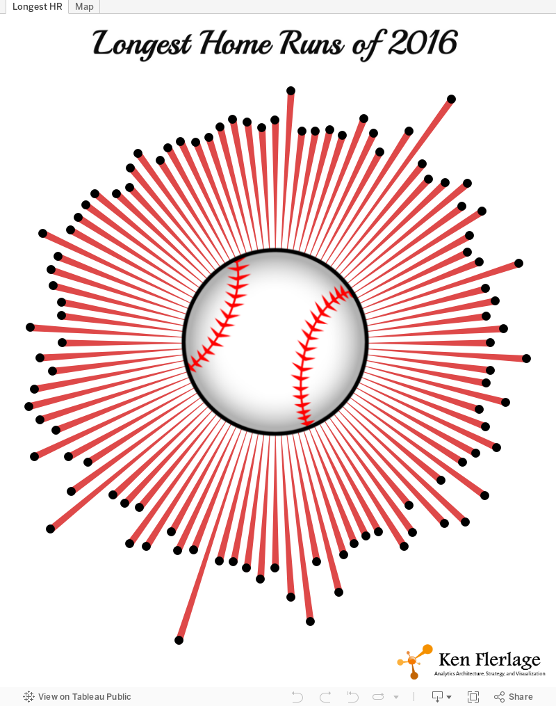
Each red line represents one of the 100 longest home runs of the season, which are ordered by date. The length of the line is indicative of the “true distance” of each home run. You can find the full visualization here.
Each red line represents one of the 100 longest home runs of the season, which are ordered by date. The length of the line is indicative of the “true distance” of each home run. You can find the full visualization here.
Ken Flerlage, November 21, 2016


No comments: