
A Retrospective on One Year Using Tableau

On June 30, 2016, I published my first ever Tableau visualization, a very simple map showing my projections for the 2016 presidential election.
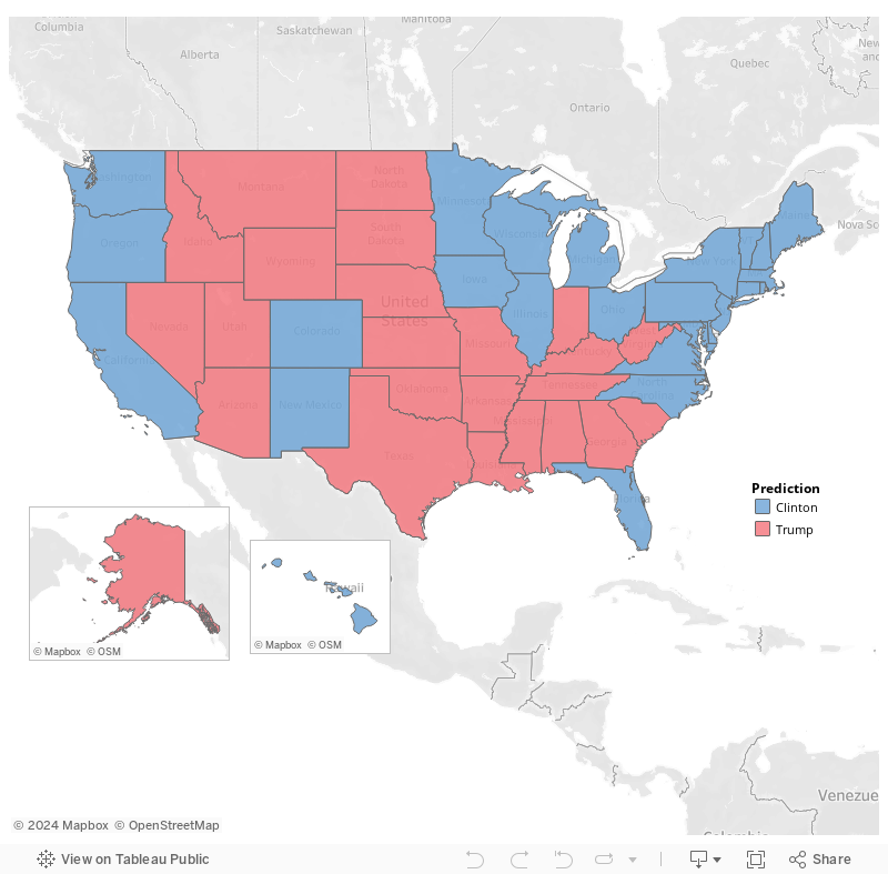
With the value of hindsight, this viz isn’t great. But at the time, I was absolutely thrilled as I was able to create this very easily and very quickly. And so began my journey with Tableau…
Pre-Tableau
Let me back up a bit and give you a little of my background. I have worked in Information Technology for nearly 20 years and have done a little bit of everything in the field—ERP implementations and administration, application development, database administration, data conversions, business analyst work, etc. Before I started working with the Tableau platform, I had been focused on Business Intelligence and Analytics for a few years. Though I loved information technology as a whole, I truly found my passion in analytics. In early 2016, after many years with one company, I had decided it was time for a change and started exploring other opportunities in the analytics field. As I was interviewing with companies, I was surprised at how many of them used Tableau. I was familiar with Tableau as a product, having used competitive products for many years, but had never really experimented with it. Then, in April, 2016, I accepted a position at Bucknell University as a Business Intelligence Architect. Bucknell, like so many others, uses Tableau. Before starting, I figured it would make sense to at least learn the basics of Tableau. So, I checked out a few online courses and eventually settled on a course available on Udemy called Learn Data Visualisation with Tableau 9 taught by Matt Francis. If you participate in the Tableau community or even the larger Data Viz community, then you know Matt. He’s one of our community’s foremost experts in Tableau and a fantastic trainer. I spent a couple hours a night for about one week and, just like that, I could do the basics with Tableau. Thanks Matt!!
While my personal projects tend to focus on data visualization, I really do love all the other aspects of analytics and, thus far, my work at Bucknell has focused on analytics strategy, architecture, and the development of our analytics platform as a whole. This was certainly the case up front, so I didn’t get a chance to really exercise my newfound Tableau skills.
Starting a Blog
In April, 2016, however, I decided to start a blog. I didn’t have any big plans for it (and still don’t), but I just wanted a platform I could use to merge my love of writing with my passion for analytics. And thus, www.kenflerlage.com was born. My first project was an analysis of Tiger Woods' decline, in which I concluded that, in athletic terms, he’s just old. In that post, I included a simple line graph comparing Tiger’s tournament wins, by age, to perhaps the best golfer ever, Jack Nicklaus. To create the graph, I used a tool I had a lot of experience with, not Tableau. While the resulting line chart was just fine, I wasn’t able to embed the interactive version into my blog, instead simply including an image.
So, in June when I called out Nate Silver, I decided to use Tableau. For some time, I had been thinking that it couldn’t possibly be that difficult to project the winner of an election (spoiler alert: I was wrong, but so was just about everyone else) so I created my own very simple model based solely on results of previous elections and polls. I wanted to include an election map like those found on Silver’s FiveThirtyEight website so I needed a tool that would 1) allow me to easily create an interactive map and 2) allow me to embed that map into a blog. Tableau seemed like the perfect fit. Plus, by using Tableau, I would be gaining valuable experience with a tool I’d eventually need in my work at Bucknell. Bonus!! After developing my model, I was able to create my election map with Tableau in an amazingly short amount of time. And, on June 30, 2016, I formally published it—my first Tableau visualization ever!!
Continued Practice
Over the next couple of months, I continued to write on my blog, regularly using Tableau Public for visualizations (I also used other tools, such as RawGraphs). But, I generally only used the default chart types available in Tableau—mostly bar and line charts, though I admittedly created too many bubble charts and word clouds early on. I found Tableau to be incredibly easy to use, but I had yet to really discover the true power of the platform.
In August, I wrote a post on visualizing hierarchies. The post started with an infographic I had seen a few years earlier, which broke down the world’s religions.
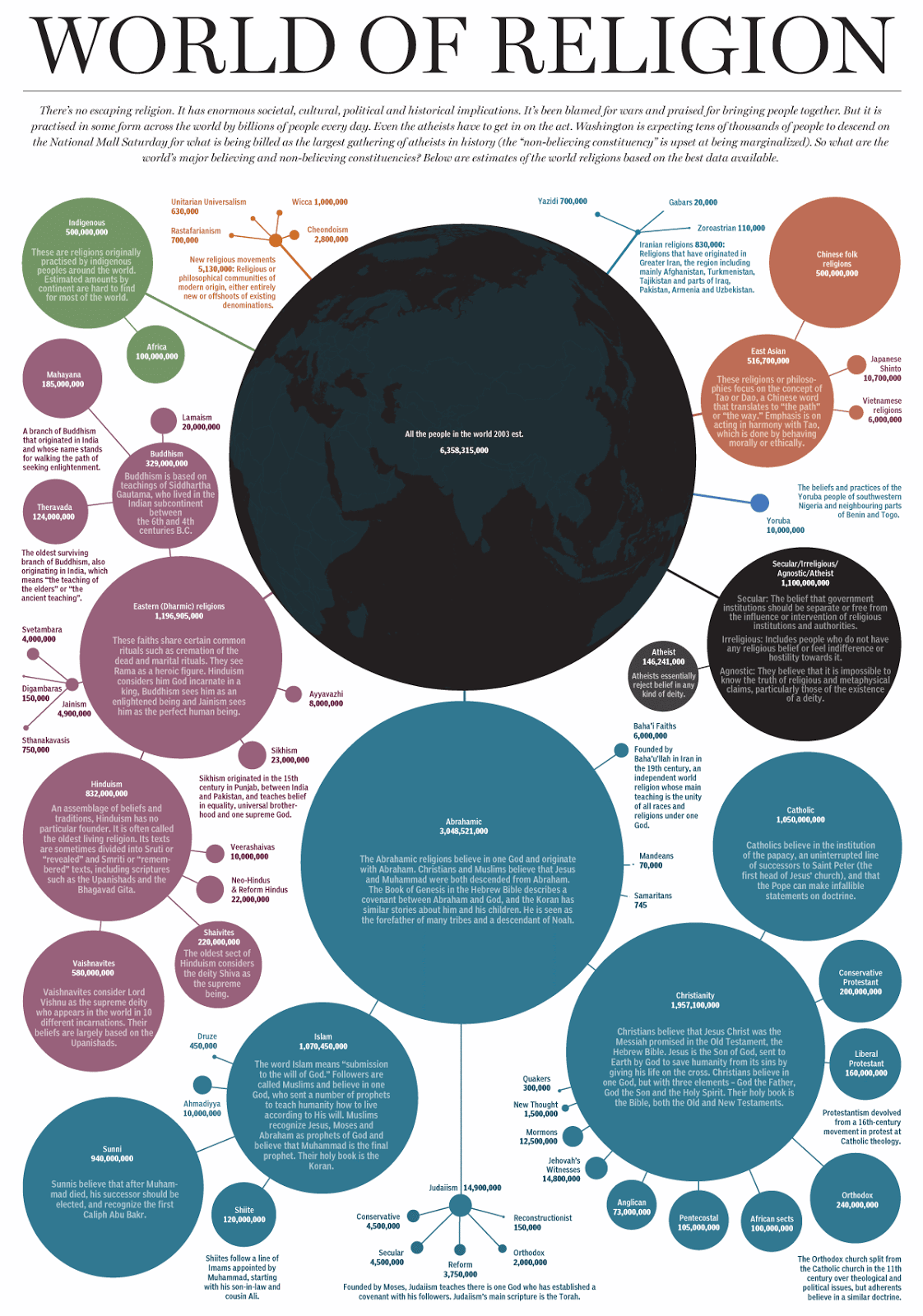
In the post, I discussed a variety of methods to visualize hierarchical data, using the religion data set in the infographic, but what I really wanted to do was recreate the infographic itself. I looked around for a method to create this type of chart, but simply couldn’t find one, in any tool, including Tableau. I concluded the post theorizing a new type of hierarchical chart I dubbed a “Snowflake Chart.”
Still Not Hooked
Following the hierarchies post, I continued writing and creating visualizations, mostly analyzing the election, but sprinkling in other topics as well. One of my most popular blog posts came in October when I compared Tableau to Power BI. At this point, I was still really new to Tableau and Power BI had been making a big marketing push. To be entirely honest, I wasn’t yet really hooked on Tableau and I was definitely intrigued by Power BI. But I was really disappointed at the lack of even-handed comparisons of the two platforms. So I decided to do one myself, hoping it could help others as well as give me an opportunity to explore Power BI. The resulting post, Tableau vs. Power BI: My Two Cents, wasn’t great for Power BI. While I saw some potential, it was very clear to me that it had nowhere near the capabilities of Tableau. Looking back at this post and considering my current involvement in the Tableau community, it would be easy for someone to conclude that I was just a Tableau fanboy, simply taking a swipe at Power BI. But, at the time, that was anything but the case. My failed attempt at recreating the religion “snowflake” chart had left me feeling that Tableau had quite a few limitations and led me to explore other platforms, including Power BI. Upon realizing that Power BI could not meet my needs, I even started down the path of learning D3, theorizing that writing my own code may be the only way to break out of the limitations of software platforms.
My Aha Moment
Though not entirely convinced about Tableau, I kept working with it. In November, I had the idea to create an interactive periodic table. I thought it would be cool to show the basic table as you normally see it, but leverage tooltips to provide lots of additional information. The problem was that I simply couldn’t figure out how to create it—as noted previously, I was still only using the standard, out-of-the box visualization types. Then, one day, I had what I’ll call my “aha moment”. I realized that the periodic table was nothing more than a Cartesian graph where each element is plotted using a specific set of x and y coordinates. By determining the coordinates of each, plotting them with a square shape, then sizing them appropriately, I was able to create the periodic table.

Now to anyone using Tableau for more than a few months, this probably seems like a no brainer, but to me, this was a revelation that opened up so many new possibilities for how I could leverage the platform. I quickly returned to the hierarchical religion chart I had wanted to create so badly and was able to apply my learning to build an almost exact replica of the original.
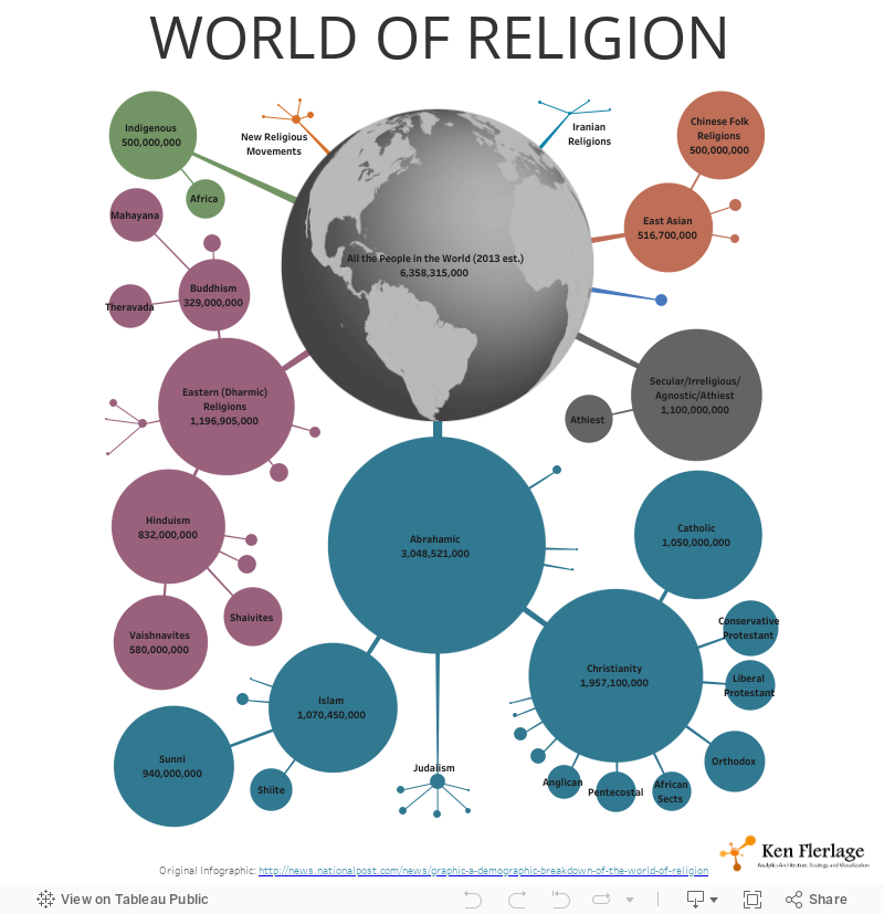
While I loved this visualization, it required a lot of manual work and I wanted a way to automate it. My experimentation led to the creation of an automated “Snowflake Chart,” which I detailed on my post, Introducing the Snowflake Chart. I was now officially hooked. I realized that Tableau was capable of creating just about anything you could imagine. And, fortunately for me, it seemed like I had a million different ideas I wanted to explore.
The Community
At this point, I was still very much a newbie, only having worked with Tableau for about five months. I had been posting my work on LinkedIn and Twitter, but I hadn’t yet fully discovered the community. That is, until the community started taking notice of my work. This started with my Famous Trees visualization winning Viz of the Day, Josh Tapley noticing my Snowflake Chart post, and Ben Jones sharing my idea of a “sized bump chart.” Then, in January, I was surprised to be named as a Tableau Public Featured Author. Josh, Ben, and the Tableau Public team probably don’t realize what these recognitions meant to me, but I was (and still am) incredibly thankful. They both validated my efforts and introduced me to the incredible Tableau Community.
From there, I really started to engage with the community. People like Adam Crahenand Jonni Walker, though maybe not realizing it, acted as mentors to me. I discovered projects like Makeover Monday and Workout Wednesday. I started diligently reading the blogs of Andy Kriebel, Andy Cotgreave, Eva Murray, and Ryan Sleeper. And I learned so much from downloading and dissecting the work of Pooja Gandhi, Rody Zakovich, Matt Chambers, Adam McCann, Curtis Harris, Chris Love, Jeffrey Shaffer, Shawn Levin, and so many more. And I discovered the work of Neil Richards, who in many ways, is sort of like my long-lost data viz twin (I have a real twin brother, but that’s something for another post), as we share many philosophies on data visualization and often come up with very similar ideas. See Neil’s blog post, So, What Were the Chances of That?, if you need further convincing. Note: I know that, in naming specific people, I will inevitably leave out others whom I’ve learned a lot from—if that’s the case, I apologize, I just wanted to be sure to specifically call out those in the community who have had a profound impact on my own development.
This community is seriously amazing. Want to create something, but have no idea where to start? Chances are there’s a blog which deals with it. If not, tweet about it or post a question on the community forum and I guarantee someone will try to help you. Want to see how someone created a visualization? Just download it and take it apart. And if you’re still confused about it, just reach out to them—99% of the time, that person will be more than willing to help.
Having discovered and fully engaged in the community, the pace of my learning accelerated significantly. The truth is that I can’t even imagine where I’d be without it. Never in my life have I seen a piece of software evoke so much passion in people and I want to thank each and every member of the community and encourage you to keep doing the incredible work that you do.
So, here’s to one year of using Tableau and many more to come!!

Ken Flerlage, July 9, 2017


I learned tableau 3 weeks ago and I am so much into it. I am competitive athlete and played some junior pro tennis and I found tableau to be similar to tennis. Everyone knows what you can do with it (forehand, backhand, table calculations, filters), but how you use it that's the key. In 3 years of my professional career for the first time after working on tableau I got a feeling that this is something that i would like to master. I have zeal and intention to be THE BEST at tableau. After reading your blog and knowing how much you have progressed in a year, I am super excited to rock and roll! Thanks man! I really appreciate it.
ReplyDelete-Mohit Choudhary
Thanks. Good luck to you!
Delete