
Can I Do That? Coloring in Tableau

This is part 2 in a 2-part series which asks the question “Can I do that in Tableau?” These posts do not intend to address any real-world use cases, but are rather meant to push the limits of what’s possible in Tableau and find creative ways to attack our problems. That being said, I hope you learn something in these post, even if it is nothing more than how to think through a complex problem and bend Tableau to your will.
In my last blog post, I asked whether or not I could created music in Tableau. The answer was kind of, but I had fun building the visualization and learned a few things along the way. This week, I will be asking whether or not I we can use Tableau to create a sort of coloring book.
A little background before we get into it. My daughter has an app on her Kindle whch is basically an electronic version of paint-by-numbers. After watching her play it, I started wondering if we could do something like this in Tableau. Like making music in Tableau, there isn’t much practical value in doing this and there are definitely better tools for this than Tableau, but I wanted to take on the challenge and, hopefully learn something along the way.
The Problem
The biggest challenge to creating a coloring book in Tableau is that the software is not designed to take user input through the mouse. Mouse clicks are valuable for selecting objects, filtering, etc., but controlling the color of shape based on a mouse click simply isn’t possible as there has to be underlying data driving the visual. So how can we tackle this challenge? The only option, that I can think of, is to create a data set which contains all possible color combinations (“combinations” is actually the wrong term for this, as we’ll discuss in a moment, but we’ll stick with it for now) of each of the shapes. Then, through use of some clever action filters, we could filter our data down to one specific combination.
Color Combinations/Permutations
The first step is to determine all of our different color combinations. Unfortunately, this will require a bit of basic statistical theory (who’d have thought we’d need statistics just to create a coloring book!!). In statistics, a permutation defines a situation where order matters, while a combinationdefines a situation where order does not matter. A good tutorial on Math is Fun gives the following examples of the two concepts:
Combination
"My fruit salad is a ‘combination’ of apples, grapes and bananas.” In this case, we don't care what order the fruits are in, they could also be "bananas, grapes and apples" or "grapes, apples and bananas.”
Permutation
"The ‘combination’ to the safe is 472." While we’d use the word “combination” in speech, from a statistical standpoint, this is actually a permutation because the order is important. The safe’s combination must be 4-7-2, in that order. 7-2-4 will not work, nor will 2-4-7.
Our coloring book involves shapes that can be a certain set of colors. Let’s start with a fairly simple example: We have two shapes and each shape could be one of two different colors, red and blue. How many different color permutations would be possible? The answer is 4, as shown below:

Each shape can be either red or blue, so they can be all red, all blue, first red/second blue, or first blue/second red. The number of permutations is 2 x 2.
But what if we add one more shape?

We now have 8. The number of permutations is 2 x 2 x 2.
So, you can see that the number of permutations will be always be 2 (the number of colors) multiplied out once for each shape. In other words:
p = cs
Where p is the number of permutations, c is the number of colors, and s is the number of shapes. Thus, if we have 5 shapes with a possible 8 colors, as my final Tableau visualization does, the number of permutations would be 85 or 32,768. Note: I decided on 5 shapes with 8 colors for a very specific reason, which we’ll get to in a moment.
With the math out of the way, we can now move onto building the data set. I decided to write some SQL Server t-sql code to generate a table of the different permutations. The code contains a series of five nested loops (one for each shape), each one looping through the 8 different colors. As it goes through the fifth and final nested loop, it will have determined the color for all five shapes for that permutation and writes it to the database. Because I need my data in individual rows, the program will actually write 5 records for each permutation (one record for each shape), resulting in a total of 163,840 records. If you’re interested in the actual code, you can find it on my GitHub repository.
Polygons
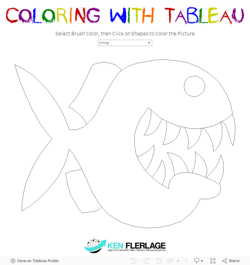
My next step would be to find an image for my coloring book. I found a cartoon image of an Angler Fish on www.vecteezy.com and decided to use it. My initial thought was to read the SVG file in order to parse out the coordinates, as I did in my post on polygonizing images, but I quickly realized that this would produce thousands of polygon points, which as we’ll see later, would be problematic. So, instead, I used the Interworks Drawing Tool for Tableau to trace the lines and create five different polygons—the fish’s body, teeth, eyes, and each fin. In the end, I had a total of about 300 points for my 5 polygons, an average of about 60 per polygon.
Visualizing in Tableau
I now have two sets of data. The first contains 163,840 records of color permutation data and the second contains my polygons. In Tableau, I joined these together based on a Shape ID I had built into each data set. This resulted in a total of 9.8 million records. Tableau Public has a limit of 10 million records, thus the reason for limiting the number of shapes, colors, and polygon points, which I alluded to earlier. If I had, for example, added just two more colors, I’d have ended up with almost 30 million records. Two more shapes would have exploded the record count to over 600 million! Like I said before, Tableau probably isn’t the best tool for creating this…
From here, I began to actually visualize the data. I created the polygons based on the polygon points. This actually created 32,768 copies of each polygon. I then created a parameter that allows the user to select the color they wish to use. Then, based on this parameter, a calculated field was used to specify the target color for each shape. Finally, using filter actions, the color of a polygon is changed to the target color.
Once all the polygons are “colored” once, then the data will have been filtered down to a single color permutation (out of the 32,768 possibilities). From there, changing the color of any polygon will switch to a different color permutation, so that we’re only ever seeing one at a time. So, we’re not really coloring anything at all, but rather, we’re filtering down to one specific color permutation, giving the illusion that we’re coloring.
Here’s the final visualization. Feel free to color the fish as you’d like and share the result with me. Also, feel free to download the workbook to better understand how it works.
A Pointless Exercise?
So, is there any value in this? Probably not. Ultimately, the result is pretty pointless and, as I’ve said previously, something like this could be done much more easily by writing a little code. But as I noted in my post on making music in Tableau, there is still value in building it. I learned a few techniques that could prove valuable in future projects. In addition, It also demonstrates the value of using data scaffolding to artificially create the data structure needed to meet your visualization’s needs. And, of course, it was fun and challenging and allowed me to push the limits of what’s possible in the Tableau platform.
Ken Flerlage, March 3, 2018


Bow Down to Sir Ken Flerlage! Your's Fan
ReplyDeleteLucid Data Artist
www.facebook.com/luciddataartist