
Pointillism in Tableau

Despite being nearly 4 years old, I recently discovered George Gorczynski’s blog post about creating Pointillistic Art in Tableau. As defined by Dictionary.com, Pointillism is “a technique of neo-impressionist painting using tiny dots of various pure colors, which become blended in the viewer's eye. It was developed by Georges Seurat with the aim of producing a greater degree of luminosity and brilliance of color.” For example, here’s a painting by Georges Seurat called “Gray Weather, Grande Jatte”
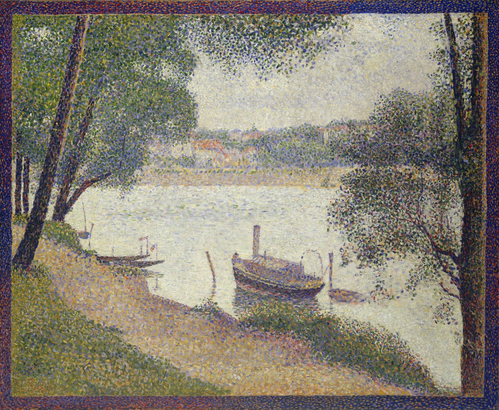
Wikipedia Commons
George’s blog includes code that reads the pixels of an image, simplifies the colors, then writes the data to a text file, which can be easily consumed in Tableau. His work is quite brilliant and it’s been used to create some really intriguing visualizations, such as Curtis Harris’s visualization of Donald Trump’s tweets (click on the image to see the full visualization).

I love how, instead of just creating the image in Tableau, Curtis encoded each dot with information about individual tweets. It’s both artistic and insightful, which I think is a great combination.
So, if you haven’t read George’s post, go check it out!
Another Technique
Shortly after discovering George’s technique, I came across an article by Matteo Ronchetti, a data scientist from Italy who specializes in machine learning and computer vision. The article, titled Creating Pointillist Paintings with Python and OpenCV, describes a brilliant algorithm he wrote in Python which converts images to pointillistic artwork. The technique shares some similarities with George Gorczynski’s method, but has some significant differences as well. For instance, Matteo wanted to mimic the small brush strokes used in many pointillistic paintings. To demonstrate this, the image below zooms in on Gray Weather, Grande Jatte.

To address this, Matteo used small ellipses instead of dots, which adds a really nice effect to the resulting image.
So, before I move on, please go read Matteo’s article—it’s a brilliant and inspiring piece of work. And, if you’d like to turn your own images into pointillistic art, download the code from his GitHub repository and give it a go.
Preparing the Algorithm for Tableau
Any time I see some amazing work like this, as a Tableau person, I always want to see if I can leverage it in Tableau. This, of course, was no exception. So, after getting permission from Matteo, I downloaded his code with the intention of exporting data so that I could recreate it in Tableau. In the end, I had made a few modifications such that the code would:
1) Export a CSV of Ellipse Data. The resulting CSV has 7 columns as shown below.

Ellipse ID is a numeric identifier of each ellipse. X and Y define the coordinates of the center of each ellipse. Length and StrokeScale define details about the length and width of each ellipse. Angle defines the rotation of each ellipse (measured in Degrees). And, Color defines the color, in hex, of each ellipse.
2) Write a Color Palette Text File. The file contains the 20 colors generated by the algorithm and is pre-formatted as a Tableau color palette so you can easily copy and paste it into your Preferences.tps file (if you’ve never create a custom color palette for Tableau, check out the Online Help).
3) Prompt for Input File. I wanted to make the code as easy to use as possible, without prior knowledge of Python, so I added code that will prompt for an input file, as well as some messaging telling the user where the output files have been written. Ultimately, I’ll package this up so that it can be run via an executable.
The updated code can be found on my GitHub repository.
Visualizing in Tableau
The first thing I did was load my custom color palette. The palette file is ordered alphabetically by color and, since my csv data has the color in it, I will be able to sort my data by the color, then apply the palette.
Next, I’d need to be able to plot each ellipse, rotate them, and color them. Unfortunately, ellipses are not necessarily straightforward to create in Tableau. So I had to use one of my favorite mathematical techniques, parametric equations (for more about using parametric equations, see Beyond Show Me Part 3: Parametric Equations). I won’t go into a lot of detail about how to create an ellipse with parametric equations, but I’ll just say that the equations account for the length and width of the ellipse as well as the rotation.
I then used a free image found on Pixabay.

And here’s the final visualization. Click on the image to view the interactive viz on Tableau Public.

As I’ve done in some of my previous posts, I think it’s really cool to see these build ellipse by ellipse, so here’s an animation. Note: I had to reduce the number of ellipses in order to get a smooth animation, so the quality is a bit lower than the full visualization.

How To
Again, if you just want to create an image, check out the code on Matteo’s GitHub repository. But, if you’d like to create it in Tableau, here’s how.
1. If you’re familiar with Python, you can download the Python Code.
2. If not, you can download the executable package, PointArt.zip. Extract all the files to your computer, then run PointArt.exe. Sorry Mac users, but I think this will only work for Windows, but if you really want to try this, I’m happy to help you get Python set up on your machine.
3. The program will guide you through the process of selecting a source image (needs to be jpeg format) and will then output three files: The csv and text files noted above and the converted image.
4. Using the color text file, create your custom color palette.
5. Open Tableau and connect to the csv file.
6. The csv only contains data about each ellipse. In order to plot the points around the perimeter of each ellipse, we’ll need additional data. For this, you’ll need my Model data set, which contains the T values needed. Download the Model.xlsx file, and add as a data source in Tableau.
7. Join the csv data to the model data using a join calculation (each side should simply be “1”).
8. Create two parameters, Length Scale and Width Scale. Both should be float. These will be used to tune the lengths and widths of each ellipse. Start out by setting Length Scale to 1.5 and Width Scale to 1.3.
9. Create a new calculated field called Point X which will be the x coordinate of the points making up the perimeter of each ellipse. The formula is as follows:
[X] + [Length]*[Length Scale]*COS([T])*COS(RADIANS([Angle])) - [Stroke Scale]*[Width Scale]*SIN([T])*SIN(RADIANS([Angle]))
10. Create another calculated field called Point Y which will be the y coordinate of the points making up the perimeter of each ellipse. The formula is as follows:
[Y] + [Length]*[Length Scale]*COS([T])*SIN(RADIANS([Angle])) + [Stroke Scale]*[Width Scale]*SIN([T])*COS(RADIANS([Angle]))
11. Drag Point X to the Columns shelf and Point Y to the Rows shelf.
12. Right click on each of them and change them to Dimensions.
13. Reverse the y axis.
14. Drag Ellipse ID to the Detail card.
15. Change the mark type to Polygon.
16. Drag T to the Path card, then change the pill to a Dimension. This will control the order in which each point is connected to create a polygon.
17. Drag Color to the Color card.
18. Set the Color pill to be sorted automatically. This will make it easier for us to apply our color palette.
19. Click on the Color card, select your custom color palette, and apply it.
20. Clear the sort on the Color pill.
21. Using the Ellipse ID pill on the detail card, make sure its sort is set to Data Source Order, which should be in numeric order.
22. Drag the Ellipse ID pill up so that it is above Color on the marks card. This will set the z-order properly so that the we have the right overlap in our ellipses.
23. If desired, fine-tune the size of the ellipses using the Length Scale and Width Scale parameters.
24. Make other adjustments as desired including gridlines, fixed axes, etc.
Or, if all those steps are too complex, feel free to download my workbook and then simply swap out the data and color palette with your own.
If you create any pointillistic art using this method, please share with me. I’d love to see what you create!! And don’t forget to check out Matteo Ronchetti’s article and further work on his website, https://matteo.ronchetti.xyz. You can also follow him on Twitter: @matteoronchetti
Ken Flerlage, May 25, 2018


Beautiful! Thank you.
ReplyDeleteThanks for the blog. While running the python code it is giving an error "No module named 'cv2'" instead of opening the File Explorer. Can you please help me in fixing the error?
ReplyDeleteCan you email me? flerlagekr@gmail.com
Delete