
An Introduction to Data Densification
Data densification is a common technique used in Tableau. Many people have written about it including the Tableau greats, Joe Mako and Jonathan Drummey, amongst many others. It is a broad topic that addresses many different use cases. I’d personally highly recommend that anyone with an interest in this topic check out Joe’s video where he discusses it in detail.
In this blog, I want to add my spin to the topic and discuss some of the specific techniques used for data densification. As I said above, nothing I’m sharing here is new or unique, but my hope is that I can take you through the process step by step in a way that is easy to understand (at least as easy as it’s possible to make this somewhat esoteric topic). I’ll do this by taking a specific use case—connecting two points with a curve—then showing you three methods for using data densification to accomplish this task.
Before I jump into the how-to, I think it’s important to note that data densification is very closely related to data scaffolding. In fact, I often struggle to delineate the two. Both create a sort of artificial structure within your data for the purpose of creating a specific type of data visualization. For the sake of this blog, I’ll distinguish between the two by saying that data densification is more focused on adding additional records (or points) within your data so that you can draw something more advanced.
Okay, let’s get started!
Use Case
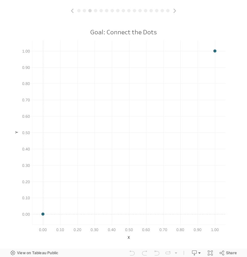
The example we’ll be using is relatively simple. We will start with a data set that has two points with x & y coordinates.

Well start out by plotting these on a scatter plot in Tableau.
Note: If you are confused at this point, then I’d suggest you read Beyond “Show Me” Part 1: It’s All About the X & Y. It will provide you with the foundational knowledge required to understand how you can draw anything you want in Tableau by using x and y coordinates.
Our goal will be to connect these two dots using a curve. In this case, we’re going to use a sigmoid curve, as it is one of the more commonly used curves you’ll see in Tableau, but the curve itself is not very important and you could use any other type of curve you desire.
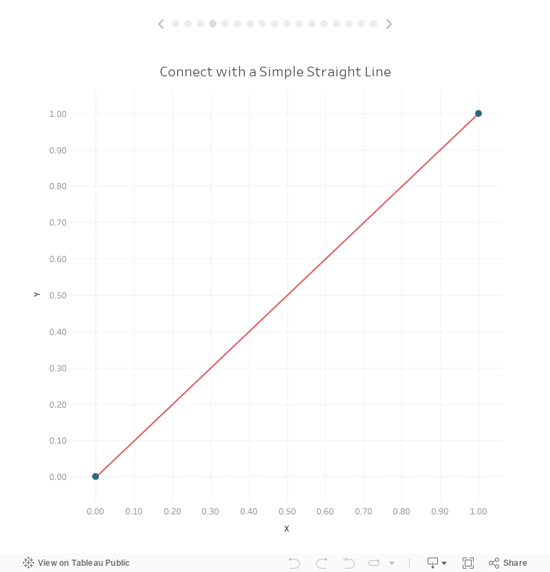
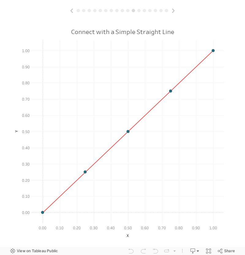
We can easily connect these two dots by simply changing our mark type to a line.
But drawing a curve is a bit more complex because Tableau does not draw curves out of the box. Thus we’ll need to densify our data.This means we will take those 2 points and add several points in between such that, when connected, they form a curved line.
Method 1: Pre-Defined Values
The first densification method is what I call “Pre-Defined Values.” Essentially, we’re going to create a set of records outside of Tableau. I’ll start out by creating a new tab in my spreadsheet called Pre-Densified:

This new tab has just one column named Extra Pointwith five sequentially numbered rows.
We’re now going to bring this into Tableau and cross-joinit to our data. A cross-join essentially links each record in one table with each record from another table. As Tableau doesn’t support this type of join type naturally, we have to trick it by using a join calculation with the value, 1, on each side (this value could be anything—a number, string, etc.—the key is that it be the same on both sides).

This will match each record in Data with each record in Pre-Densified. Our first of two points will be joined with the pre-densified record of 1, then with 2, then with 3, 4, & 5. The same thing will happen with your second point so you end up with a total of 10 records.

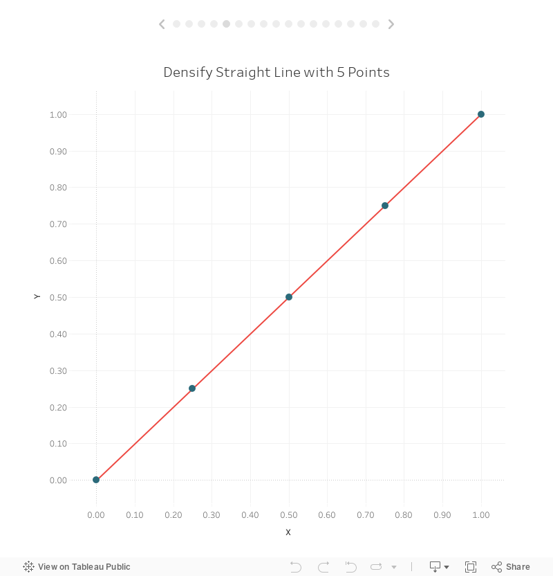
Before we jump into drawing curves, let’s start by drawing a densified straight line. This is, of course, unnecessary, as a straight line can be easily drawn between these two points without the need for extra points in between (as we did earlier), but hopefully this exercise will help us to ease into this complicated topic.
We’ve densified our data five times, so our goal will be to plot five evenly-spaced points along the line, then connect them. I won’t go into the math, but we can describe this line in the form of the equation, y=x. So, if we can figure out the value of x, then getting y is easy—it’s the same as x. But how do we get x? Well, we know from our data that the x coordinate of our first point (point A) is 0 and the x coordinate of our second point (point B) is 1. That leaves us with 3 additional points which we want to space out evenly from 0 to 1. If you do that math that means each point will be 0.25 away from the previous point:
Point 1: 0
Point 2: 0.25
Point 3: 0.5
Point 4: 0.75
Point 5: 1
So basically, we need to subtract 1 from the point number, then multiply by 0.25. For example:
Point 1: (1 - 1) * 0.25 = 0
Point 2: (2 - 1) * 0.25 = 0.25
Point 3: (3 - 1) * 0.25 = 0.5
Point 4: (4 - 1) * 0.25 = 0.75
Point 5: (5 - 1) * 0.25 = 1
But, we don’t want to hard-code the 0.25 value. Instead, we want to let Tableau determine the spacing between each point automatically so, if we eventually decide to increase the number of points in our densification, we won’t have to change our formulas. So, let’s start by creating a calculated field to find the spacing. We’ll do this in two steps. First we’ll calculate the maximum number of points using a Fixed LOD calculation.
Max Densification Points
// Maximum number of points in our densification data.
{FIXED: MAX([Extra Point])}
Then we’ll calculate the spacing.
X Spacing
// Spacing between our x coordinates.
1/([Max Densification Points]-1)
So, in our case, we have 5 points, so X Spacing will be 1/(5-1) or 1/4 or 0.25. If we had 11 points, then our spacing would be 1/(11-1) or 0.1.
Now we can calculate the X coordinate as defined earlier:
Densification Straight X
([Extra Point]-1)*[X Spacing]
And, since we know that y = x, we can set our Y coordinate equal to X:
Densification Straight Y
// The equation of this line is y=x.
// Thus y will always be the same as x.
[Densification Straight X]
With our coordinates calculated we can now plot this as a line:
So, there’s the basic idea of data densification—we’ll artificially add more points to our data so we can plot those points in order to draw something more complex. But, as I noted earlier, doing this for a line is kind of pointless since we can easily connect our two points to draw that line. But, these extra points are critical when it comes to drawing curves. This leads me to a key point I wish to make. Curves, when drawn in Tableau, aren’t really curves at all—they are a series of straight lines that approximate a curve. If you add enough of these straight lines then it becomes impossible to tell that it’s just a bunch of straight lines. Thus, to draw a curve, we need to plot extra points between our start and end points, then draw straight lines from one to another. And, we need to do this enough times that it looks like a smooth curve. If this is a bit confusing, hold on and I’ll show you some examples shortly.
Okay, let’s plot this as a curve. The process for doing this will be very similar as the line we’ve already drawn. Like the line, we’ll start with an equation that defines the sigmoid curve:
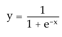
It’s not really necessary to fully understand this equation as long as we can translate it to a calculated field in Tableau. We’ll get to that in a moment, but, like the line, we can see that, in order to get y, we need to first have a value for x. Here’s the calculated field for X:
Sigmoid X
// Space our points out evenly from -6 to 6 in order to produce a nice smooth curve.
([Extra Point]-1)*(12/([Max Densification Points]-1))-6
As noted in the comments, plotting a smooth sigmoid curve between two points will require us to space the values evenly between -6 and 6, in a similar fashion to the way we spaced the line points evenly between 0 and 1.
With our X coordinate defined, we can calculate the Y coordinate:
Sigmoid Y
// Sigmoid calculation. Note: EXP gives us e to the power specified.
1/(1 + EXP(-[Sigmoid X]))
Again, don’t worry about the math…this is just a formula to allow us to calculate the extra points in a way that replicates a curve.
Now let’s plot our new X and Y coordinates:
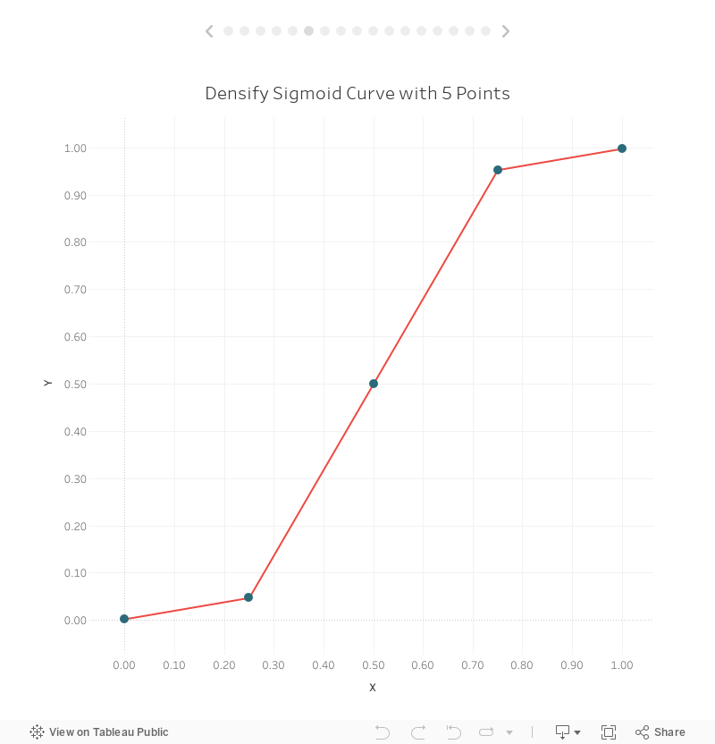
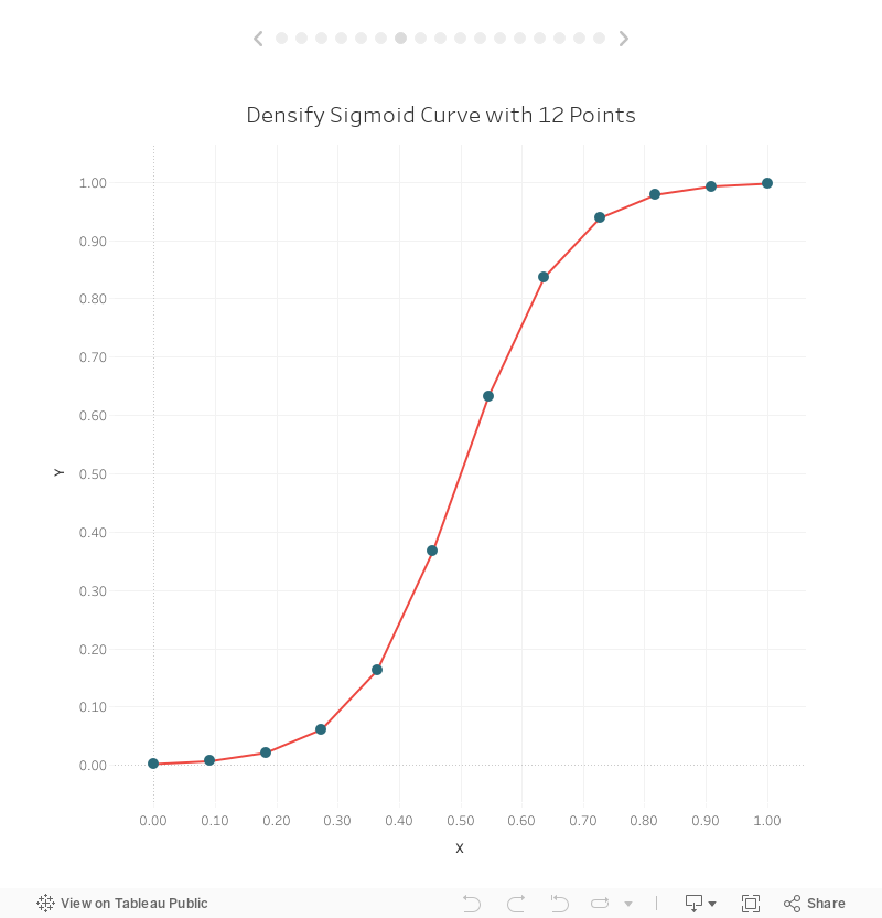
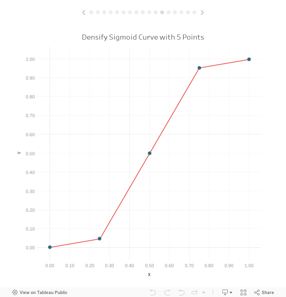
That doesn’t look too much like a curve, does it? But remember that we’re just approximating a curve by drawing a bunch of straight lines. Since we’ve only densified our data with 5 points, the curve isn’t very smooth, but we can easily increase the number of points in our data. Let’s go back to the Pre-Densified tab in our spreadsheet and increase the number of extra points to 12:

Now we’ll see a slightly smoother curve:
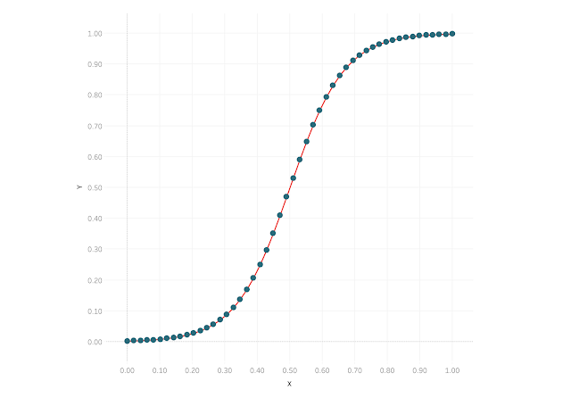
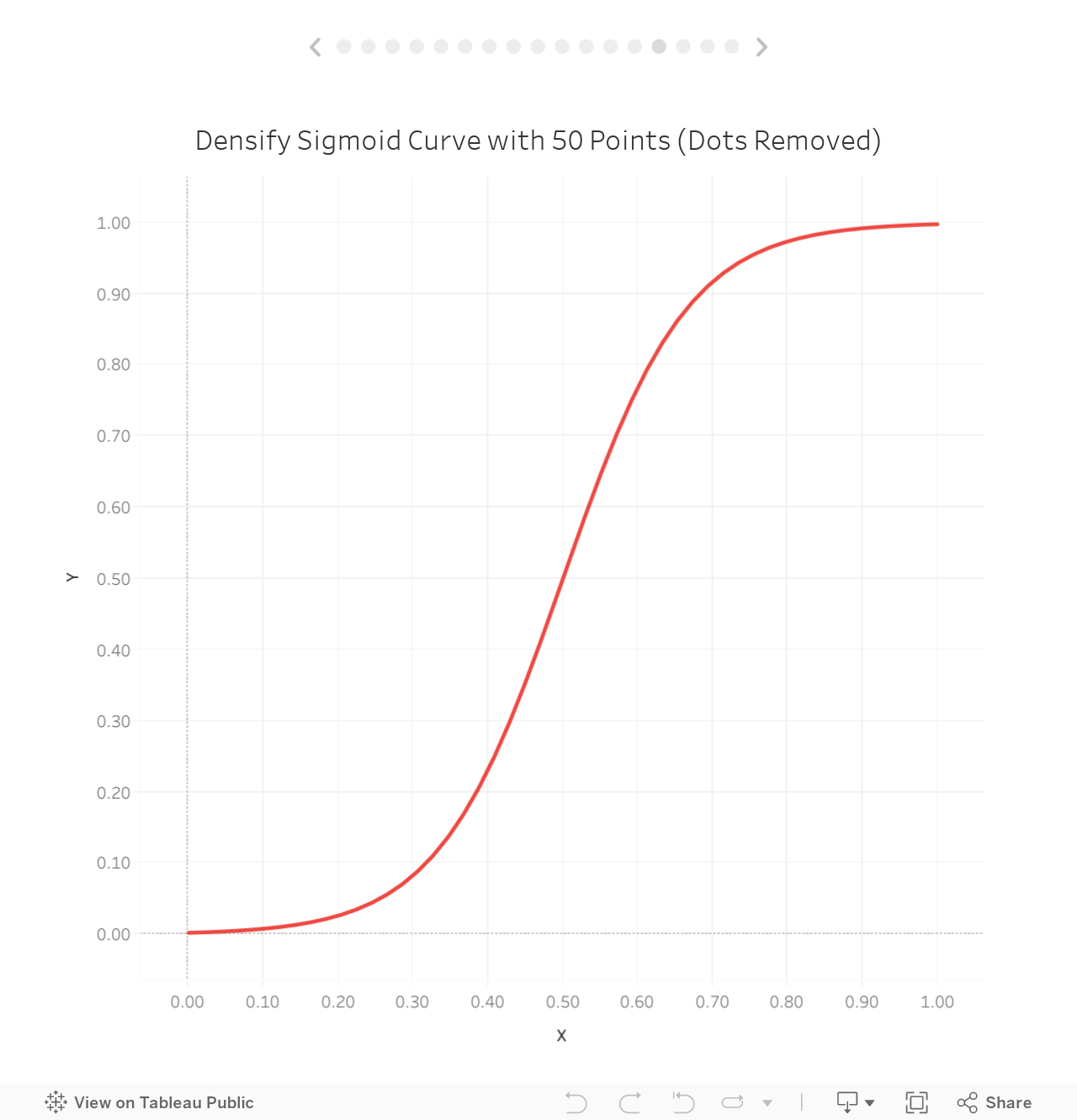
But it’s still a bit blocky, so let’s update our source data to include 50 points.
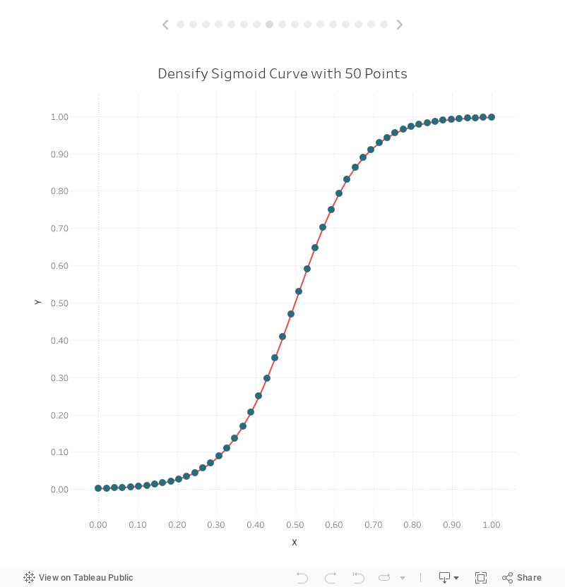
Looks pretty smooth now! If we remove the individual points, we’ll see that we do have a very smooth curve:
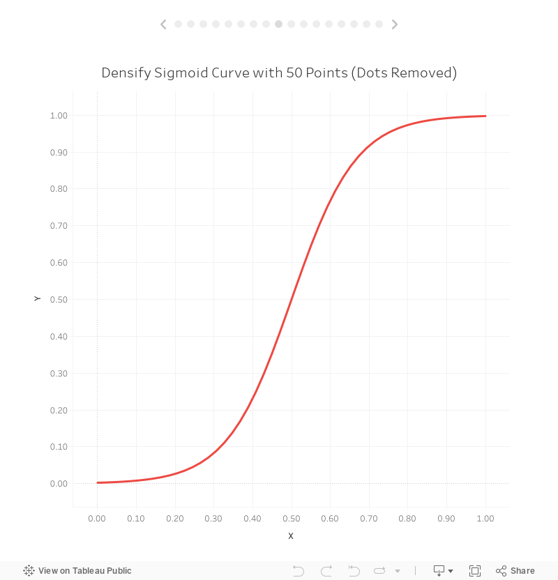
We’ve just successfully drawn a sigmoid curve using data densification!! Next let’s talk about some alternative methods.
Method 2: Fixed Range & Bins
For this next method, we’re not going to pre-define all of our individual extra points. Instead, we’ll use bins to artificially densify the data. We will, however, need some extra data to make this work, so let’s create a new tab in our spreadsheet which I’ll call Bins:

Like the pre-densified model, we’ll cross-join this new table to our data:

Once we do this, our data will look like this:

We want to plot five points to draw the line (thus the range of 1 to 5), but we now only have two records for each point. This is where bins will come into play. Start by creating bins on the Range field with a bin size of 1:

Before we start building anything, we need to make sure this bins field is set to display all missing values (2-4, in our case), so on your sheet, drag Range (bin) to the rows shelf:

You’ll notice that it only shows the two values from our data, 1 and 5. Right-click on the Range (bin) pill then choose “Show Missing Values.

We’re now showing the values between our start and end range. Now drag this pill over to the Detail card, where it will remain. Your worksheet should now look like this:

Now we want to create an Extra Point field, which looks and acts exactly like the Extra Point field from our pre-defined data set. To do this, we’ll use the INDEX() function.
Extra Point
// Give us a 1, 2, 3, ... n value based on bins.
INDEX()
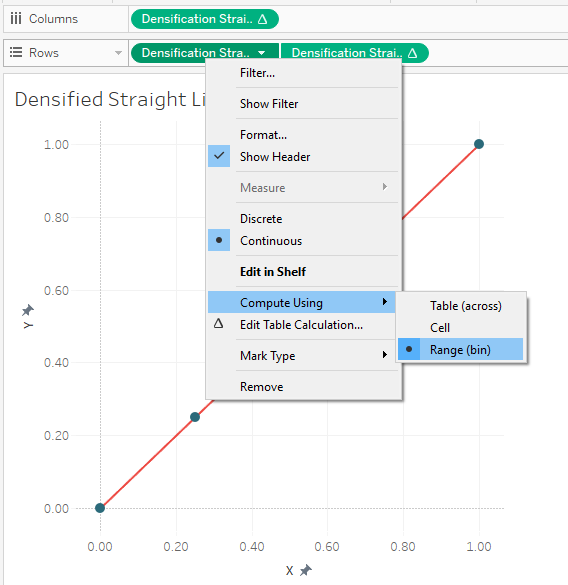
Drag Extra Point to the detail card. Once there, right-click on the pill, select “Compute Using” then choose “Range (bin)”. This will result in our two square blocks changing into five:

Okay, hang on with me—we’re almost done!
Most of our calculated fields will be the same as those used with the pre-defined values method. One exception is Max Densification Points which must be modified as follows:
Max Densification Points
// Maximum number of points in our densification data.
// Use window function to make it available for all Index values.
WINDOW_MAX(MAX({FIXED : MAX([Range])}))
The remaining calculations are all the same. I’m including them here for convenience.
X Spacing
// Spacing between our x coordinates.
1/([Max Densification Points]-1)
Densification Straight X
([Extra Point]-1)*[X Spacing]
Densification Straight Y
// The equation of this line is y=x.
// Thus y will always be the same as x.
[Densification Straight X]
Sigmoid X
// Space our points out evenly from -6 to 6 in order to produce a nice smooth curve.
([Extra Point]-1)*(12/([Max Densification Points]-1))-6
Sigmoid Y
// Sigmoid calculation. Note: EXP gives us e to the power specified.
1/(1 + EXP(-[Sigmoid X]))
Now, with all of this in place, we can plot the points exactly as we did before. Let’s start with drawing the straight line.

One key difference with this approach is that your X and Y coordinate fields will all be table calculations because they are using the Extra Point field, which is generated using an INDEX table calculation. So, all of the pills must be set to compute using Range (bin).
In the end, our straight line, drawn using 5 points, looks exactly like the one drawn using the pre-defined values method.
The same is true of our 5 pointed curve:
So how do we update this to include more points in order to draw a smoother curve? We just need to update the Bins tab in our spreadsheet to go from 1 to 50:

That will result in a nice smooth curve.
Method 3: Configurable Range & Bins
Our final method is a slight variation of the second method. In this case, we want to set up Tableau to allow the user (or developer) to specify the number of points in a flexible manner. Once again, we’ll start with a Bins tab in our spreadsheet, but the range will only go from 1 to 2:

Next we’ll create a parameter called Number of Points.
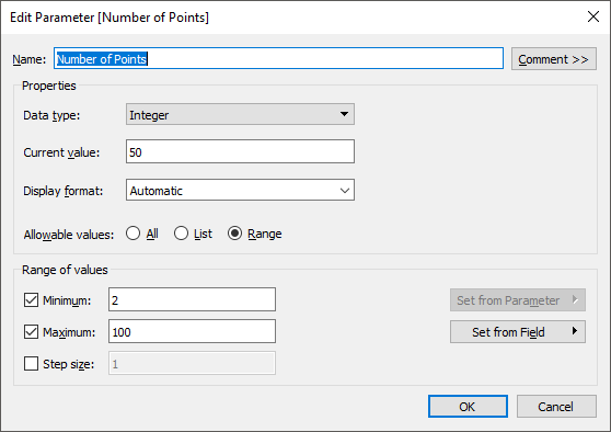
Note: I’ve set the parameter’s Range of Values to start at 2 because we need at least 2 points to draw a curve. And I’ve ended it at 100 arbitrarily; for most use cases, approximately 50 points will give you a smooth curve.
We’ll change the Max Densification Points calculated field to equal the value specified in the parameter.
Max Densification Points
// Maximum number of points in our densification data.
[Number of Points]
We’ll now want to set up our bins so that it goes from 1 to the Number of Points. To do that, we’ll need to create a new calculated field which I’ll call Range Adjusted.
Range Adjusted
// Adjust the Range to go from 1 to <Number of Points>
IF [Range]=1 THEN
1
ELSE
[Number of Points]
END
Then we’ll create our bins field based on Range Adjustedinstead of Range, setting the bin size to 1.
The rest of the calculated fields will be the same as method # 2.
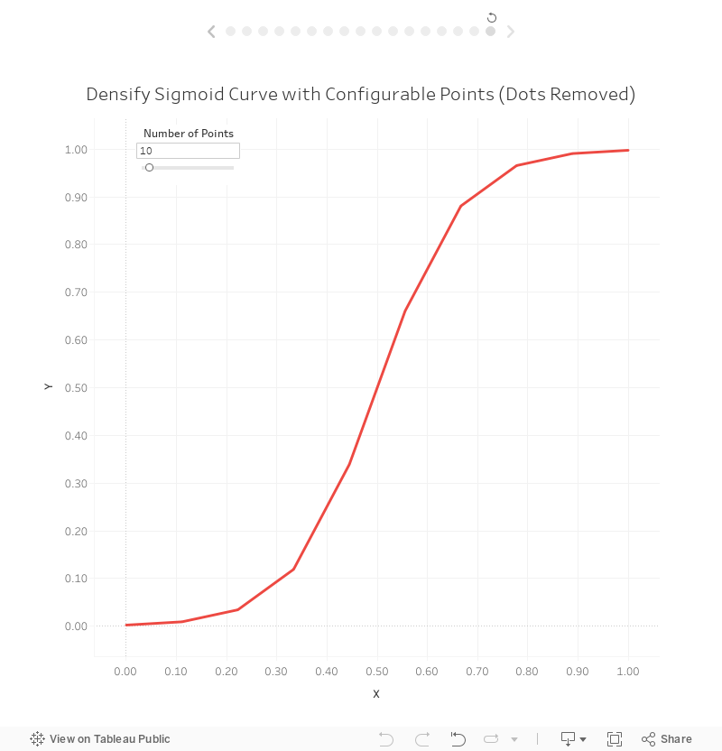
The result will be a curve where you can manually adjust the number of points. For example, here’s the curve with 10 points:
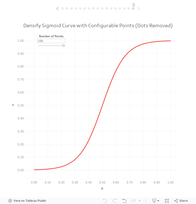
And here it is with 100 points:
Which is Best?
Now that we’ve discussed these three methods, let’s talk briefly about which of them is best. As with everything in our field, this doesn’t have a straightforward answer. Generally speaking, however, I tend to choose the pre-defined values method for a couple of different reasons. First, it’s easier. You just create a record for each new point, then use that throughout your calculated fields—no need for bins and table calculations. Second, because it does not use table calculations, it is often more performant.
However, the pre-defined values method results in a much larger data set. Using this method with a densification of 50 points, our data set ended up with 100 records, whereas the bins methods resulted in only 4 records. While this will not be an issue with small data sets, imagine that your source data has 10 million records. You data will explode to 500 million records vs 20 million—a huge difference—which will impact performance, size of the data, etc. That being said, using bins and table calculations on 10 million records will also cause a performance hit. Which one will be more performant at the end of the day? I can’t be sure and my guess is that it would depend on many other factors.
One other thing to note is that there are cases where the bins method simply makes more sense than other methods. Take, for example, my Shapeshifting Tile Maps. This allows you to create a tile map of the United States using polygons with a configurable number of sides. So you could create a square tile map (4 sides), a hex map (6 sides), a circle tile map (50+ sides), etc.
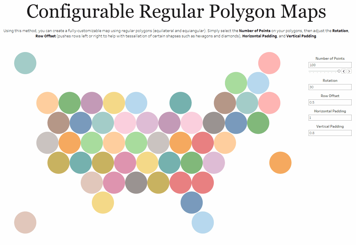
Because I want the user to be able to specify the number of sides, I need to use my third method which allows the user to change that number via a parameter.
So, there isn’t necessarily a clear winner here and you’ll see both methods used frequently. That said, whenever possible, I try to use the pre-defined values method in order to reduce complexity.
Example Use Cases
Finally, before wrapping this post, I wanted to provide a few use cases where you can leverage data densification. The first example is virtually any kind of curve. Sankeys, curvy bump charts, curvy timelines, jump plots, arc charts, etc. all require use of data densification. There simply is no other way to draw curves in Tableau.
But curves aren’t the only use case for data densification. Take for example, this tweet from my friend Vince Baumel:
I'm thinking of ways to visualize multiple sequential color palettes in something like a Palette Reference. Has anyone done something like this? If so, how did you approach it? pic.twitter.com/lxGfnWzzng— Vince Baumel (@quantum_relic) February 18, 2019
Vince was using these visuals to demonstrate different color palettes. To create these in Tableau, you can use data densification. They require to you create lots of extra points, which are then individually colored using the given color palette.
Related to the above, I recently wrote a blog on how to create gradient colored bar and area charts like the one below.

This gradient coloring, as you may imagine, required the use of data densification.
Finally, you can use densification to create some more practical charts, such as a unit chart.
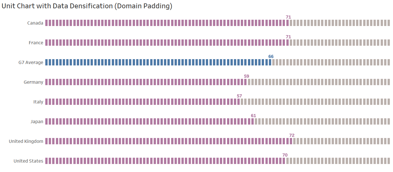
Zen Master Jeffrey Shafferjust recently wrote a blog on how to create this type of chart using data densification, so be sure to check that out: How to Recreate a Unit Chart in Tableau Using Data Densification
Once you understand the concept of data densification, you’ll start to see lots of different opportunities to use it in your work. It can be really tricky at first, but with practice, it can become almost second nature.
Thanks for reading!
Note: I presented on this topic on a recent Think Data Thursday. This presentation is basically a video version of the blog, so if you prefer video, you can find it here:
Note: I presented on this topic on a recent Think Data Thursday. This presentation is basically a video version of the blog, so if you prefer video, you can find it here:
Ken Flerlage, May 18, 2019


Ken, this is meticulous work again. Thank you very much for sharing your knowledge.
ReplyDeletePS: I'd never thought of seeing the sigmoid function in the context of 'imputation.'
Zen Master Ken,Amazing Skills Sharing.Thank you
ReplyDeleteHi Ken, Thanks for the great articles!
ReplyDeleteVery interesting article, but (in my humble opinion) not very pragmatic. In this example (and many more that I've seen) you're increasing the data set by a factor of two. Would you still apply the same method to a data set that contains more than a million rows of data? My guess would be that the average user would experience some loss in performance on Tableau Desktop. Then spinning this up to a server for a dashboard that has several other visualizations? I love the article, I just don't a see a practical application when the first step is "double your data set."
ReplyDeleteNo I would not recommend applying this technique if you had millions of records in your database. There are other methods of doing data densification that do not require duplication (essentially, using the data itself for the binning mechanism), but when you're using bins and table calculations with millions of records, that will also have a huge negative impact on performance, as I noted in the "Which is Best" section. So I wouldn't necessarily recommend that option either.
DeleteSo, to more directly answer your question--if you needed to perform a technique like this on millions of records, then in most cases, you would not be trying to create a single line (or in the case of a sankey, a polygon) for each record. Thus, I'd recommend that you aggregate your data ahead of time. That will reduce the records to the point where the duplication of those aggregate records would not have a severe impact on performance.
Thanks for this great article and explanation, Ken! I have a follow-up question: I have a ~5M record data set for a sankey (using the "model" tab of your sankey excel data template) - would Relationships per the new Data Model work here, instead of cross-joining, then taking an extract? I'm wresting with extract creation problems since the data set is huge after it's densified. I'm thinking that since the join doesn't happen until viz run-time with Relationships, this might allow me to create a much smaller extract of my data, then join it to the sankey model data for densification as the sankey is being rendered. What do you think? Any other strategies you might recommend?
ReplyDeleteThanks again!
Katie
That's a really good question, Katie. My standard answer for this is that, if you have that much data and want to create a sankey, your best bet will be to aggregate your data. I still believe that's the best approach as sankeys are always going to aggregate your data to a certain level--you could never show all of those 5M records in a sankey. That said, I do realize that sometimes, it's easier to bring in the raw data (or you may need it for other charts). The idea of using relationships is interesting. I haven't tried this myself, but in theory, it should work. If you try it, let me know!
DeleteI took my first shot at data densification this weekend. I picked a pretty complicated example. Basically, I have the dispersion (in x and y) of a number of golf shots. I wanted to have an ellipse that showed how many shots were contained within a certain confidence interval.
ReplyDeleteYou can see my attempt at https://public.tableau.com/app/profile/steve7299/viz/Ellipse_16689447773940/Dashboard1?publish=yes
It took me a couple of days. And, it is VERY clunky. And, I'm not sure it's quite right either.
I wanted to plot the x and y coordinates of an ellipse with an 80% confidence interval. I used the standard equation for an ellipse, calculating the x and y coordinates using the angle, factored in the slope (I think the ellipse's longest axis should go along the line of the slope but I guess it depends on the variance of the x and y data - the one with the larger variance should have the longer axis), and moved the center of the ellipse to Xbar and Ybar.
The confidence interval of the ellipse can be changed in the calculations for the a and b parameters of the ellipse. For both a and b, you just need to multiply by the constant for the chi-squared statistic for the probability you want (basically, how many points should be inside the ellipse versus outside of it).
I tried to densify the data by 360 (one for every degree). When I did this it through off the values of my original xy scatter plot. So, I divided those by 360. (Does data densification always do this or did I do it wrong? This is my first attempt at data densification.) It's hard to tell, but my ellipse doesn't fully close as the last point doesn't connect back to the first point.
I couldn't figure out how to get my scatter plot and ellipse on the same chart (perhaps I need to duplicate the data to do that). So, I tried overlaying the ellipse as a transparent worksheet on the xy scatter plot of the original chart on a dashboard. I did this very crudely (haven't used dashboards before).
Any help on streamlining this or making it look better would be greatly appreciated.
Could you email me? flerlagekr@gmail.com
DeleteGreat article, but there's a mistake:
ReplyDeletePoint 3: (3 - 1) * 0.25 = 0.55
Thanks. I'll fix that.
Delete