
Tableau in Motion (Guest Post)

Today I'm honored to be hosting a guest post by the brilliant Alexander Varlamov. Alex has been doing some absolutely incredible work in Tableau and has innovated a number of new techniques. So please enjoy the blog and be sure to follow him on Tableau Public and Twitter.
A couple weeks ago, I published two visualizations which transformed one chart into another (click on the animations to view the full viz).

Leo Tolstoy, ‘War and Peace’
Note: The above uses a technique I wrote about recently which shows how to turn images into data: Data Driven Pictures in Tableau
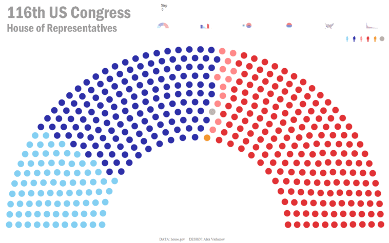
House of Representatives in Motion
I was amazed at how many likes, retweets, and questions I received via Twitter. Since there was such interest, I’m going to use this blog to tell you how I created them and how you can create your own.
In the ensuing Twitter conversation after posting my transforming charts, Jesse McConnell mentioned a session called Tableau in Motion from the 2018 Tableau Conference. The session discussed a new feature being developed by Tableau which provides animated transitions during interactions within a visualization. But these animations are not purely aesthetic. They are intended to help people understand what is changing. For example, without transitions, if you have a sorted bar chart and switch to another type of sorting, you can see the bars change positions, but it’s not exactly clear what specific changes took place unless you flip back and forth. Animation helps to fill this gap by showing the transitions as they occur.
You also likely remember the recent fascination with animated bar charts—“bar chart races” as they were called—where bars would change positions and values as time passed. It was very visually appealing, but as mentioned above, really helped to aid understanding. It was no wonder that many people tried to create similar versions of these charts, including the amazing Ludovic Tavernier who showed us How to Build an Animated Bar Chart Race in Tableau.
Another Approach
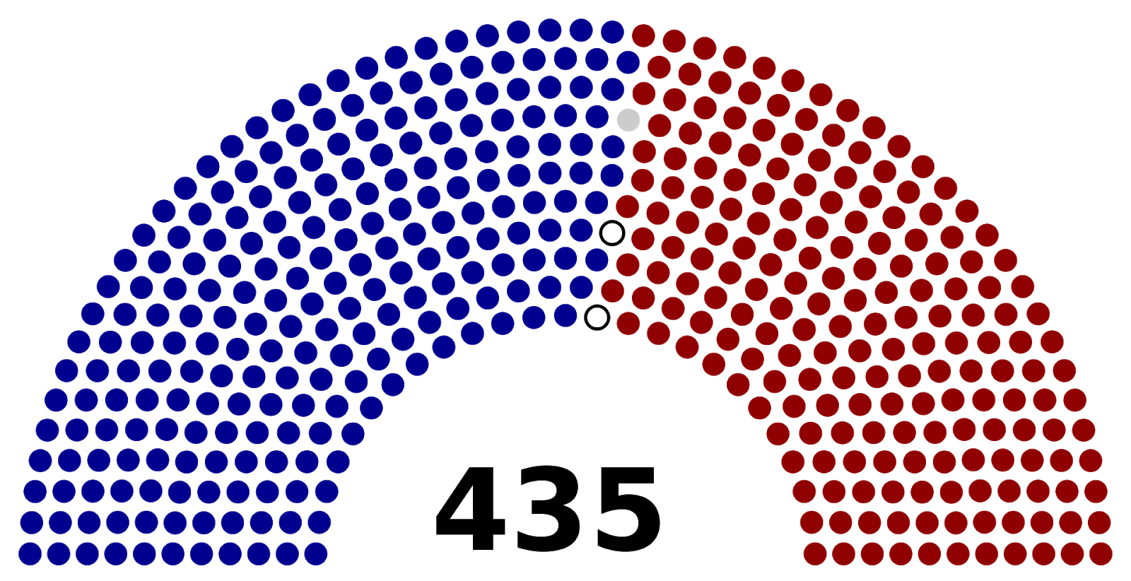
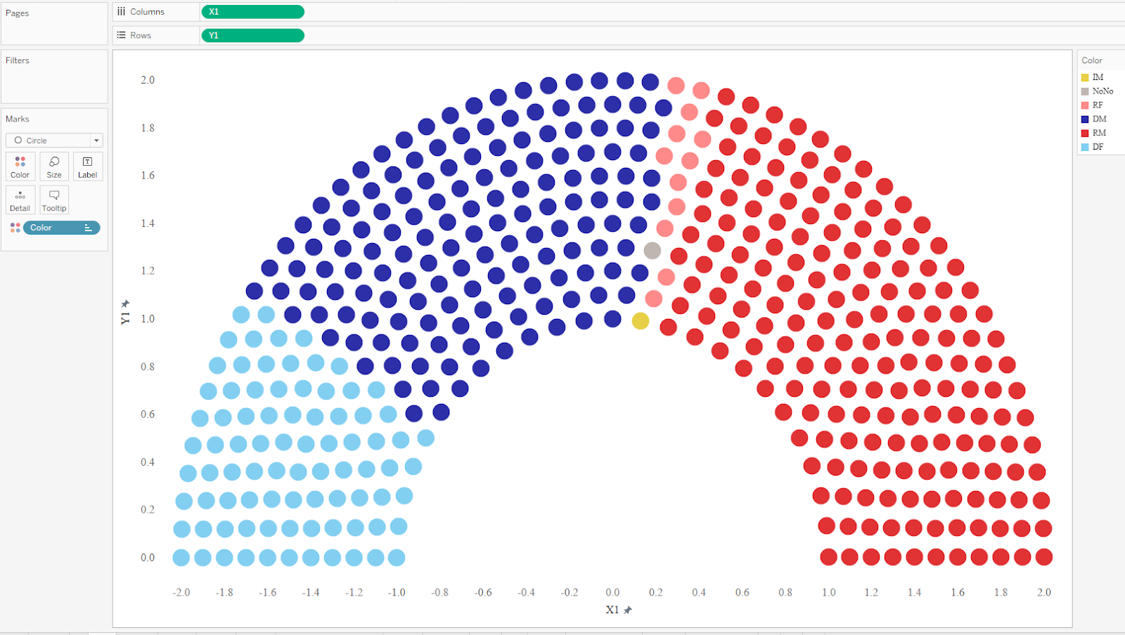
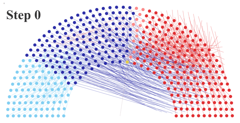
Now let’s consider another approach for creating animated visualizations in Tableau. Just as the universe consist of atoms, we can imagine visualizations as particles. For example, let’s start by looking at a parliament chart showing the US House of Representatives and its 435 seats which are shown as colored dots.
Wikipedia
To build a similar chart in Tableau, I created an Excel data set with a row for each representative and used some mathematical calculations to determine the X and Y coordinates for each dot. In addition, I included data about each member’s name, party, gender, and state from www.house.gov. I then built the parliament chart, using color to represent the party and gender of each member.
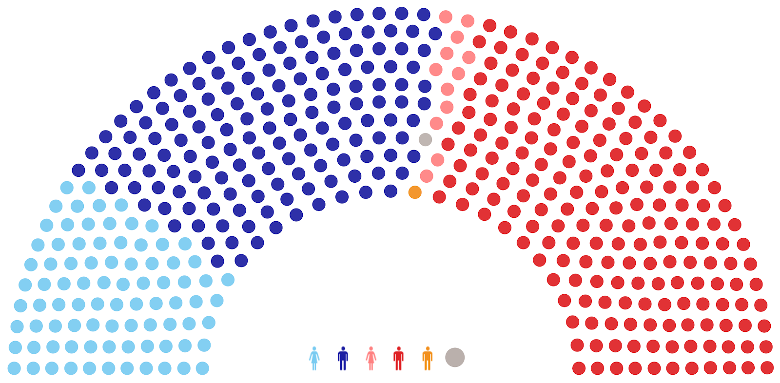
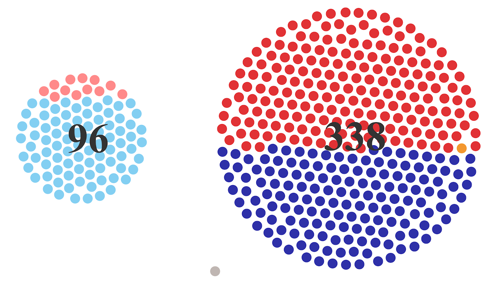
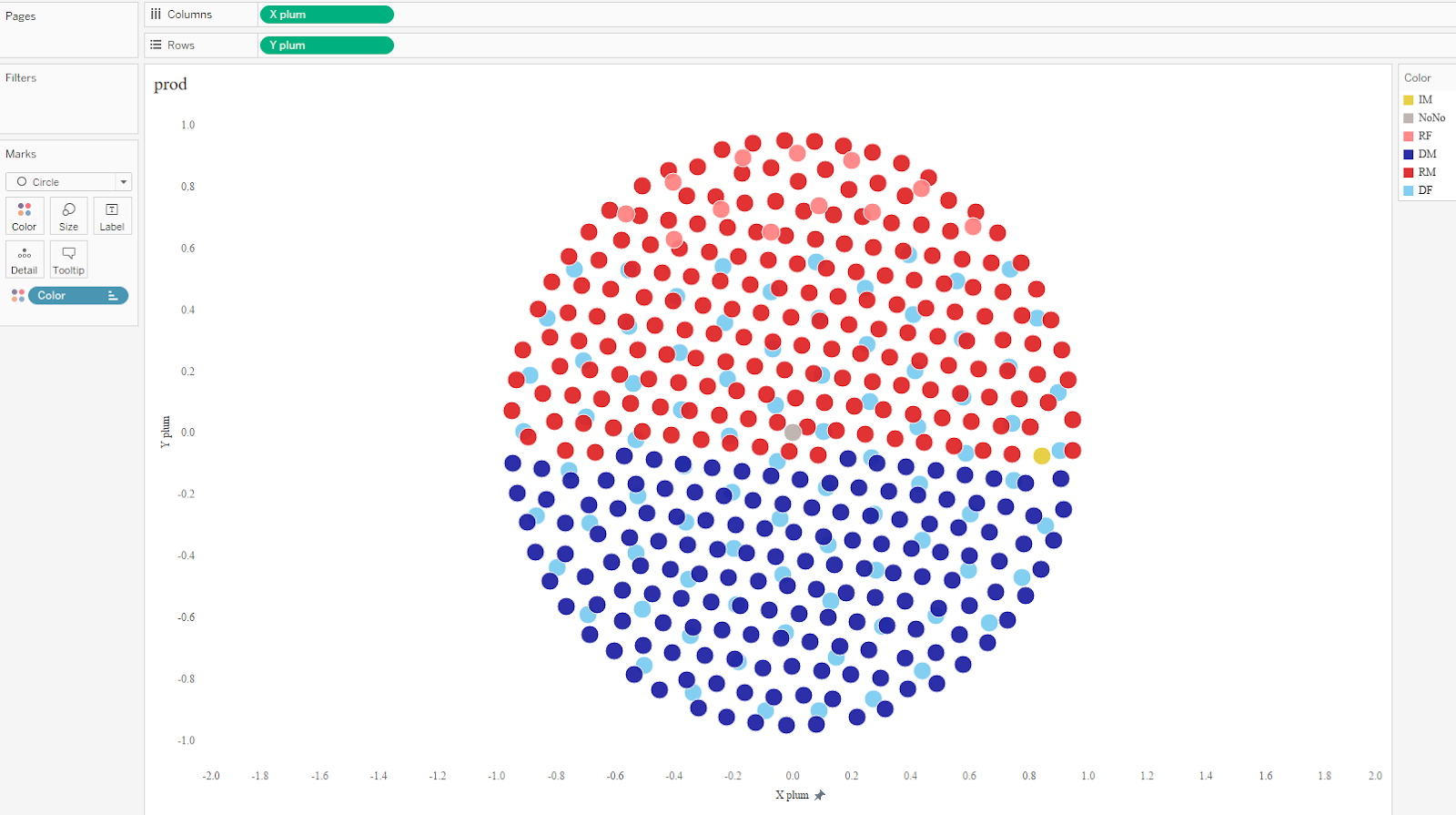
But a parliament chart is just one way to visualize this data. For example, we could create a “plum pudding chart” (or circular waffle chart) which plots each of the 435 dots equidistant from its neighbors. For this data, I’ve divided the representatives into 2 separate groups, by gender (plus a third which represents a vacancy).
Similarly to the parliament chart, this chart uses X and Y coordinates to plot each dot in a particular position.
Note: To learn how to create a plum pudding chart, see Kizley Benedict’s blog on Lindsay Betzendahl’s website, How to Create a Plum Pudding Chart
We can then take the coordinates for the plum pudding chart (X plum, Y plum) and put them next to our parliament chart coordinates (X1, Y1) on our Excel spreadsheet.
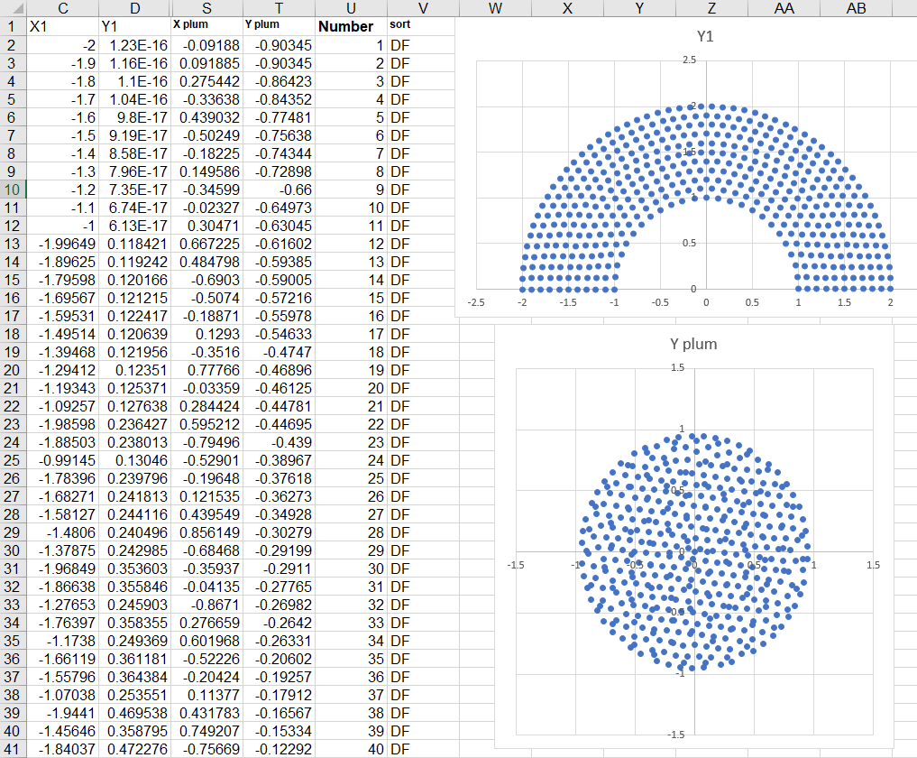
As you can see, each representative (each dot) now has coordinate for both types of charts—our starting position (X1, Y1) and our finish position (X plum, Y plum). We can now create both charts in Tableau quite simply. Let’s start with the parliament chart.
Note: I would recommend fixing the axes.
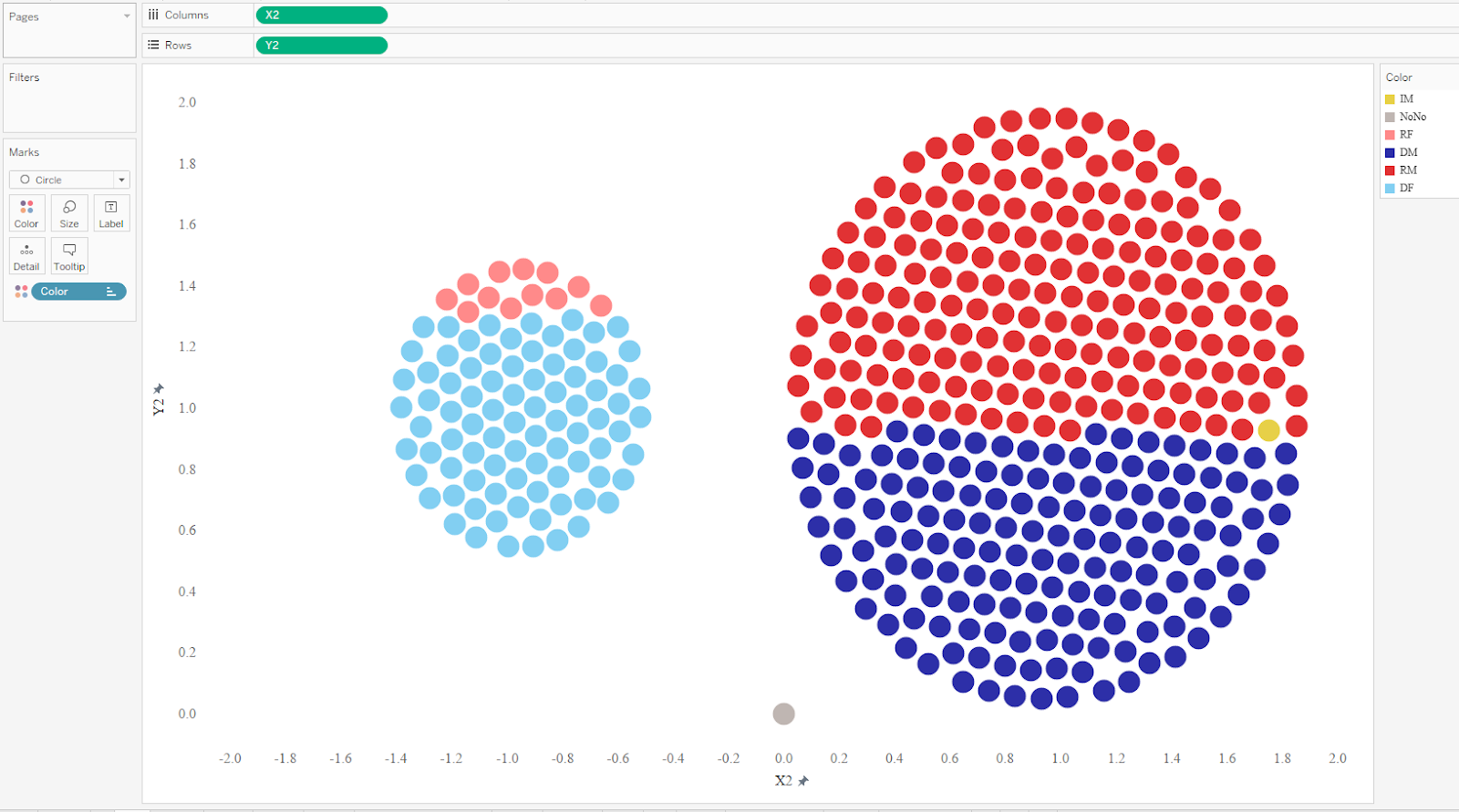
With the plum pudding chart, we notice the intersection of some dots from other categories.
We can use a calculated field to adjust the coordinates in order to eliminate this problem. The below calculation adjusts the X coordinate by gender.
(CASE [Gender]
WHEN 'F' THEN -1+[X plum]/2
WHEN 'M' THEN 1+[X plum]
ELSE 0
END) * 0.95
Note: 0.95 and 2 are stretch ratios and -1, 0, +1 are shifts along X axis.
I won’t show it here, but I created a similar calculated field to adjust the Y coordinate.
Animating the Transitions
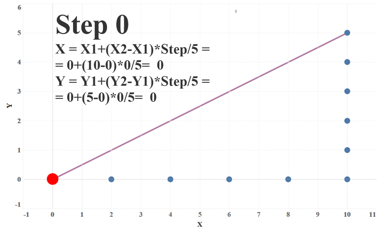
Okay, so we now have our start coordinates (and chart) and our finish coordinates (and chart). Next we need to find the trajectories required to move the dots from their starting positions to the ending positions. The simplest approach to creating these transitions is to move the dots along a straight line as shown below.
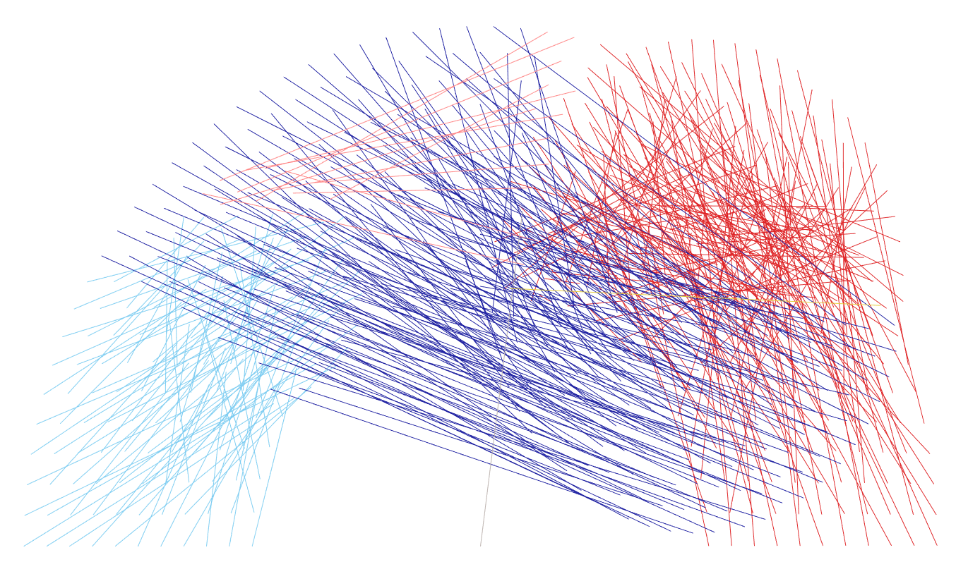
To do this, we need to first define the number of steps (or “frames”) we wish to take to get from start to finish. For each step, we’ll calculate the X and Y coordinates and plot those. Each of these steps will move the dots slightly closer to its final position. The following formulas will give us these coordinates:
X = X1 + (X2 – X1) * Step_Number / Number_of_Steps
Y = Y1 + (Y2 – Y1) * Step_Number / Number_of_Steps
In these formulas, X1/Y1 are the start coordinates and X2/Y2 are the finish coordinates. The following animation illustrates how these formulas work with 5 steps:
To provide the Step_Number, we use a parameter. This allows you to configure as many interim steps as desired.
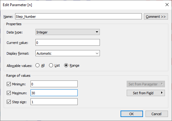
In my viz, I created a slider parameter control that allows you to step through each interim step.
If we then animate this, with one frame for each step, we can see the dots moving from their starting point, along a straight line, to their finish points.
Alternatives
We have considered our dots as “data atoms” and moved them along straight line trajectories. But this is just the beginning. We could use any type of mark—polygons, shapes, lines, etc.—as our atoms. For example, the following shows a transition from a line chart to an area chart.
And, if desired, we could move our atoms along other types of trajectories such as curves. It’s just a matter of determining the math to calculate those trajectories. But, ultimately, the sky is the limit!
Thanks for reading! Please be sure to follow me on Tableau Public and check out my other blogs.
Alexander Varlamov, August 25, 2019


Great. But how would you make the parameter automatically change stepwise without actually manually sliding it - for example using a button action?
ReplyDeleteThe only option for doing that currently is the pages control, but that doesn't work on Server/Public/Online. But, there are some new features coming soon which should make this all possible.
Delete