
Experiments with Ternary Plots in Tableau

A few months ago, I started a conversation on Twitter where I asked for people’s thought’s on parallel coordinates plots:
I don't have a lot of experience with parallel coordinate charts but I've encountered a couple recently. My general opinion of them, at this time, is not positive. Seems like there are much better options. So change my mind! Anyone have any good use cases or good examples?— Ken Flerlage (@flerlagekr) February 7, 2019
This led to some fantastic conversation which, I’ll admit, definitely helped to change my perspective on these charts. It also led to me attempting to build a number of different charts to visualize multivariate numerical data, which I’ll share in a future blog. As this conversation developed, we also began a discussion about alternatives to parallel coordinates charts and RJ Andrews, author of the fantastic book Info We Trust, mentioned the Gibbs Triangle, also known as a Ternary plot.
Did I hear someone mention the Gibbs triangle? (1873!) https://t.co/2HN6UrVSuz— RJ Andrews (@infowetrust) February 8, 2019
Trilinear/ternary plots aren't really a thing anymore. Has anyone ever tried one out? pic.twitter.com/1nPsRiT7ZF
I had never heard of this chart type before so I read up on it a bit and decided to include it in my project on visualizing multivariate numerical data. Shortly after this conversation, the brilliant Adam McCann wowed us with this beautiful and insightful Tableau visualization, which became Viz of the Day on March 1, 2019.

This visualization used a ternary plot to show “the most unique words by character for each chapter in the 5 Game of Thrones books.” After seeing this, I immediately messaged Adam to tell him how fantastic it was. I also mentioned that I had been planning to build a ternary plot for another project and he said to go for it, so I began working on it.
Fast forward a few days and I saw this tweet from Alex Selby-Boothroyd, Head of Journalism at The Economist.
I'm always in awe of the great things my colleagues come up with, but this interactive by @JamesFransham, @martgnz and @futuraprime is exceptionally good https://t.co/MDIUOzSuE7 pic.twitter.com/CAYi5ErrPa— Alex Selby-Boothroyd (@AlexSelbyB) February 22, 2019
The tweet shows another ternary plot, but what I loved about it was the tracking lines that help provide context about the actual values of each of the three measures being visualized. So, I decided to also build that feature into my own ternary plot.
In this blog, I’ll discuss the results of my experiments with ternary plots, discuss some of the technical details of how it was built, what I learned, and what I like and dislike about this chart type.
Ternary Plots
Let’s start out by talking a bit about ternary plots. A fantastic blog on datavizcatalogue.com defines a ternary plot as a “triangular-shaped graph is used to plot a dataset with three variables, where the sum of all three adds up to a constant amount. Typically the data is in percentages or in an equivalent decimal form. Ternary Graphs visualise the ratios between the three variables, by simply positioning a dot in accordance with its position on each of the three axes (using barycentric coordinates).”
Okay, so in some ways, these plots are similar to a scatter plot, yet they plot 3 variables on a triangular. As the blog does a fantastic job of explaining ternary plots and their use cases, I won’t go into this much further here. Just go read the blog and come back. I’ll wait…
Percentage Ternary
As described on the blog, ternary plots are very useful in fields such as geology and chemistry as you can use them to fairly easily plot the makeup of various samples into three component parts. That being the case, my first attempt at building a ternary plot in Tableau showed chemical compositions—carbon, nitrogen, and silicon—of 1000 samples (note: this data set is completely fictional and simply used to show a sample of the chart).

My reason for using chemical composition data is simply that I found it easier to understand when the three variables add up to 100%. In such cases, no normalization of the variables is required, which makes the chart easier to comprehend. In addition, when all add up to 100, a large value in one variable will always mean a smaller value in another variable, which means that placement on the triangle will not only tell you about the relationship between the variables, but also something about the raw magnitude of that variable (I’ll come back to this when I discuss my second example).
We can look at this chemical composition ternary and immediately get some good insights. The color of each dot is a specific category of samples, so we can quickly see that the blue category are more heavily made up of carbon than nitrogen and silicon, but there are a number of outliers in this category (in the upper right hand side of the chart) that have very low amounts of carbon. And, there are some in the middle area of the plot that contain a much more balanced amount of each element.
The Technical Stuff
Having discussed my first attempt briefly, let’s go back and discuss some of the technical aspects of building this in Tableau. Fortunately, the basic ternary plot is relatively straightforward—we just need the math for finding the x and y coordinates so we can plot them on a scatter plot. Luckily, the calculations are pretty well documented on Wikipedia. Essentially, our three measures are labeled A, B, and C. The maximum A value will be in the lower left hand corner of the triangle (coordinates 0, 0), the max B will be at the bottom right (1, 0), and the max C will be at the top (0.5, √3/2). We can then take the values of A, B, and C and plug them into the following formulas to get the x and y coordinates of each of those points:
X

Y

From there, we just plot the x and y coordinates on a scatter plot. To get the triangle in the background, I simply used an image that I created in PowerPoint.
That’s the easy part. The most complicated aspect of this implementation of ternary plots is the tracking lines. The math here is relatively complex, so I am not going to go into a lot of detail. I will, however, give you the basic idea of the methodology, at a high level. First of all, we need to use some data scaffolding to create the extra data needed to draw each of the three lines. Next, we’ll need some geometry to figure out how to draw the lines. The key is to find the intersection (shown in blue below) between the lines radiating from each point (orange) and the lines that make up the sides of the triangle (grey).
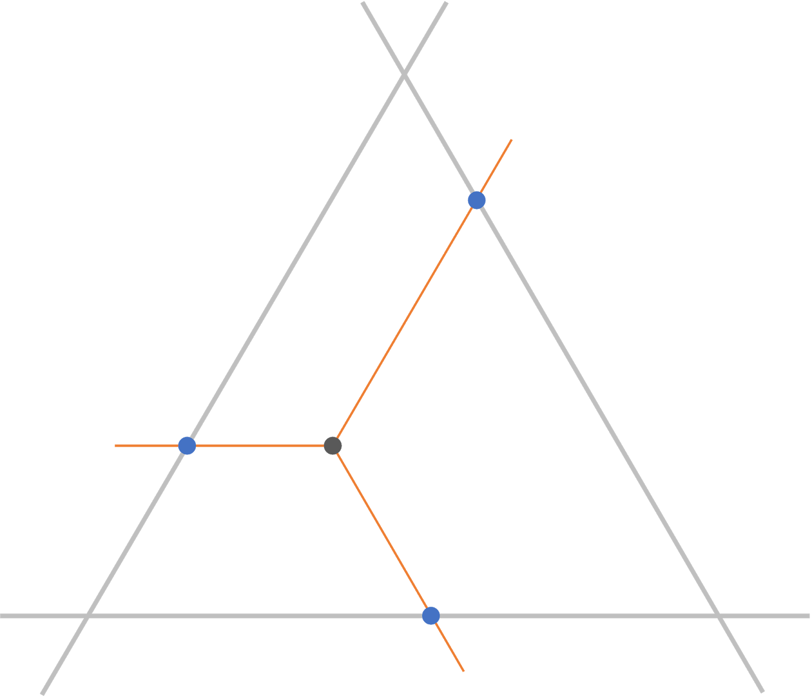
To do this, we need to put each of the six lines into equations in slope/intercept form. Then, we’ll use some math to find the intersections. The basic idea of the math is that we’re finding a point on each line where both x and y are the same. Because these are different lines, there will only ever be one such point. So, since we have both equations in slope/intercept form, which describe the line using x and y variables, we can essentially set the equations equal to each other and solve. Finally, having found that intersection point, we can end our radial lines at that point.
Okay, I know that doesn’t do a great job of explaining it, but I’m not going to go into any further detail about that here. If you’re interested in the math, I’d recommend that you read the following, which proved to be a good refresher for me: intersection of two lines. Also, feel free to download my workbook and explore my calculated fields. I’ve tried to do my best to clearly organize them into folders and to include comments on each field so that they are as understandable as possible.
Finally, we need to set it up so that the connecting lines will only be drawn for the highlighted point. To do this, I used one of my favorite features—set actions!! (Note: I created this before parameter actions were a thing. Had I created this now, I’d probably use parameter actions instead). I created a set action that would, on hover, add the point to a set. From there, I was able to create some calculated measures to determine the end points of the tracking lines, then use those measures as a dual axis to actually draw them. Again, feel free to download the workbook if you’d like more details.
Non-Percentage Data
Okay, with the technical stuff out of the way, let’s build a slightly different ternary plot using non-percentage data. I dug up some data I had previously visualized which rates various comic book superheroes and villains in a number of different categories, rating them on a scale from 0 to 100 (source: www.superherodb.com). Specifically, I chose to visualize each character’s strength, speed, and intelligence.

Fortunately, these three measures use a shared scale. As mentioned in the math section, I believe this aids understanding tremendously, as it does not require the data to be normalized, the act of which takes an already difficult-to-understand chart and further obscures the data.
However, even with a shared scale, the numbers are not percentages—they do not always add up to a single value. One character may have strength of 10, power of 20, and intelligence of 30, while another character may have 90 for all three. So, from that standpoint, the chart can still be a bit difficult to understand. For example, Solomon Grundy, appears in the bottom left hand corner, indicating that he is very strong (a rating of 93).

Were this a percentage, it would indicate Solomon Grundy is stronger than all other characters. But, because we’re not dealing with percentages here, that is not the case. Galactus, for example, appears near the center.

Yet, Galactus has a strength rating of 100, seven points higher than Solomon Grundy. Thus, in this case, proximity to the corners do not necessarily mean higher ratings for that specific variable. Rather, it means that the character’s ratings are more heavily weighted towards that variable. Solomon Grundy appears far into the bottom left corner because he is strong, yes, but also because he is slow and not very intelligent. Galactus, on the other hand, is strong, fast, and intelligent—he is not weighted towards any of the three characteristics. In other words, Galactus is much more balanced.
In my ternary based on percentage data, I had labeled each axis to show where there were low and high levels of a certain element, but because of what we’ve just discussed, that will not work in this case. So, instead, I chose to create a separate key which includes three triangular “quadrants.” The three quadrants in the corners of the triangle indicate characters weighted more heavily towards one of the three qualities, while the fourth, in the middle, shows those characters who are more balanced.
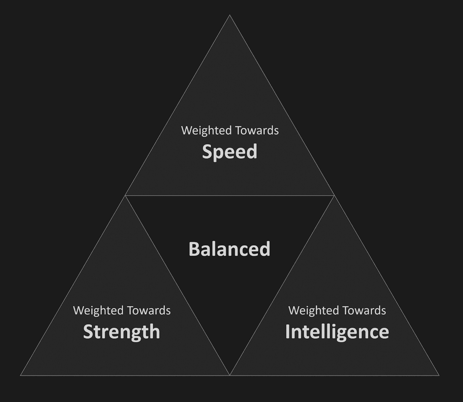
With this key, I think the chart becomes much less confusing and we can easily gain insight quickly. We can, for example, see that most of the characters are fairly well-balanced. Those who are not well-balanced tend to be more intelligent than strong or fast, such as the Joker or Lex Luthor.

The tracking lines are also a significant problem. I wanted to draw them perpendicular to the axes, as was done on the chart by the Economist, but, like the issues we’ve discussed, these tracking lines do not work properly when the measures do not add up to a standard total, such as 100%. Thus the parallel tracking lines do not connect to the correct position on each axis. At best, this makes them useless. At worst, they can be misleading.
Final Thoughts
After creating a couple of ternary plots, I have to admit that I have mixed feelings about them. There are some obvious problems. First and foremost, they are confined to just three variables. This, of course, limits the potential use cases quite a bit. My superhero data set, for example, actually has three other variables—Durability, Power, and Combat. What if we wanted to visualize all six at once? We could use a ternary and allow the user to select the three they wish to compare, but if the goal is to visualize all six at once, that may not be the best option.
Additionally, despite having spent quite a bit of time with them, I still find them quite difficult to read. At their best—as in the case of comparing chemical compositions—I think they can be quite effective as a point’s placement on each axis is quite meaningful. At their worst—such as a case where we are comparing measures with different scales—I feel like they can be very tricky to fully grasp. That being said, the chart is ultimately more about getting a macro understanding of your data than understanding each individual data point. And, in that sense, they can be a valuable tool in our toolbox, especially when you provide visual aids such as the key I share earlier. So, as I always say, whether or not you use a ternary plot will be largely dependent on your data, your audience, and the story you’re trying to tell.
Ken Flerlage, July 3 1, 2019


Hi Ken, I try to regenerate the dashboard in my own template. But when drag all of the dimension and measures to the worksheet as you did, i can only get the points in the worksheet. Is there any way to connect the intercept, and generate the line? I upload the dashboard into my public account. if you have time, please help to check that. Thanks https://public.tableau.com/profile/robert.wang#!/vizhome/Ternaryplots/Sheet2
ReplyDeleteThe tracking lines are triggered from the "Highlighted Record" Set. Something needs to be added to that set for the lines to be drawn. Take a look at the actions in my workbook and you'll see that I've created a set action on hover. Set up that same action and you should see the tracking lines being drawn.
DeleteThanks Ken. The track line show up with the action set. Have another question for the line connected each points (line AB,AC, BC, and the small triangle line in the big triangle ABC). How to get these lines show up in the worksheet? When I drag your pointX and point Y, the line automatically generated. But in my worksheet, I can only see the points, instead the points with line.
DeleteI'm not sure I follow. Perhaps it would be best to handle this offline. Would you be able to send me an email at flerlagekr@gmail.com?
DeleteHi Ken,
ReplyDeleteI guess the labelling for the Nitrogen is false, it should be the other way round
Edit: let me rephrase that: I guess the highligher line for nitrogen is false, as it shows for example 10.6% but it reaches into the "high nitrogen" labelled area
ReplyDeleteThanks for the blog and sorry for using parameters instead of Sets in my Makeover Monday viz.
ReplyDelete